
You can find a collection with all the optical illusions in this article (and more!) on CodePen. You can move your mouse over many of the demos below to reveal the effect or stop the animations.
1 - Poggendorff Illusions
The Poggendorff illusion is an optical illusion in which a diagonal line interrupted by a vertical bar appears misaligned, even when both segments are actually continuous.
A simple version of this effect can be seen in the following demo. I used the ::before and ::after pseudo-elements to create the diagonal line and the vertical bar, respectively.
The effect can also be seen in a more elaborate version with multiple diagonal lines and vertical bars:
This drawing can easily be achieved using two CSS gradients: one tilted at 70 degrees and another consisting of a series of vertical columns. I applied it to the body, although I could have used :root instead.
Another variation of this illusion is the Münsterberg Poggendorff Arch, in which the two sides of an arch appear misaligned and seem as though they will not meet at the top - but they do (mouse over to see it).
2 - Induced Gradients
The following illusions combine gradients and flat colors. Surprisingly, some of the gradients do not actually exist. They are simple gray bars that, when placed over a gradient, appear to have gradients themselves.
Take the following demo: all three bars (two vertical ones on the sides and one horizontal bar in the center) are the same shade of gray. The only real gradient is behind them, which tricks our brain into believing that the bars are different colors and even contain gradients.
Here is another variation of this effect. It looks like the central line has a repeating gradient of dark and light grays, but in reality it is a flat color. If you mouse over the demo, the bar will expand, making it clear that there is no gradient at all.
3 - Cornsweet Illusion
The next few optical illusions share a common idea: some colors are identical, but they do not look the same. This typically happens when regions of the same color or brightness are surrounded by areas with different contrast.
For example, in the following demo, the left and right ends are the same shade of gray. However, one looks lighter because it is closer to white, while the other looks darker because it is closer to black. Mouse over to reveal that they are, in fact, the same color.
4 - White's Illusion
Run the following demo. You will see two gray columns in a black-and-white grid. Both columns are the same shade of gray, but the one surrounded by black appears darker than the one surrounded by white.
I coded this demo using mix-blend-mode so I could try something a bit different. That worked well, but it also made it harder to showcase the effect on hover. In hindsight, I should have planned that better.
This optical illusion also works with colors. For example, these two squares appear to be different shades of blue, but they are the same color. This time, you can mouse over to reveal the effect:
5 - Wertheimer-Koffka Ring
The ring in the following illustration has the same color all the way around. However, one side is placed over white and the other over black, which makes them look different. If you mouse over the demo, the red bar will disappear, making it more obvious that the ring is a single, uniform color.
6 - Adelson's Illusion
You have probably seen the illusion involving a checkerboard and an object casting a shadow, where two tiles - one seemingly light and one seemingly dark - turn out to be the same color.
This demo follows the same principle. You will see two tiles labeled A and B. Both have the same shade of gray, but most people cannot tell at first glance (or second, or even third).
7 - Asahi illusion of Brightness
The circle at the center of this flower-shaped element is the same white as the rest of the page, but it gives the impression of being brighter, as if it were emitting light.
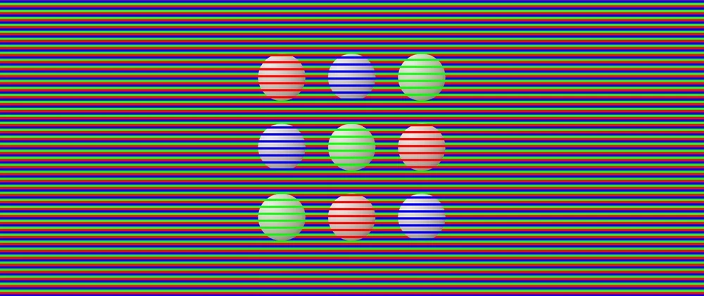
8 - Color Spheres
This is one of my favorite illusions in the collection. The circles (or spheres) look red, blue, or green, but in reality they are all the same grayish color. Our brain "colorizes" them based on the lines that overlap the shapes. Don't believe it? Mouse over the illustration.
9 - Colors from Contour
In the following illustration, the lines inside the yellow section appear blue, while the lines inside the blue section appear red... but they are all black (or very dark gray). The white contour creates the illusion of color. Mouse over to remove the contour and the lines will clearly appear black.
10 - Curvature Blindness
One set of lines looks straighter (top) while the other looks more curved (bottom). In reality, both sets are equally wavy. The only difference is how they are colored: changing the color at the peaks makes the lines look straighter. Changing it at the inflection points makes them look more curved.
The CSS code for the wavy lines is adapted from a Temani Afif snippet on CSS-Tricks and his wavy shape generator.
11 - Cafe Wall
This is a classic optical illusion and an easy one to code in CSS. Three gradients are all that is needed to generate the effect in which the horizontal lines appear slanted, even though they are perfectly parallel.
12 - Penrose Triangle
This optical illusion depicts an impossible shape. Parts that should be in front appear in the back, top becomes right, and everything feels contradictory. I coded this one some time ago for the 2024 Divtober event.
13 - Ebbinghaus Illusion
Which orange circle is larger: the one on the right or the one on the left? It is a trick question: both are the same size. However, having smaller surrounding elements gives the impression that one is larger.
I also created an animated version of this illusion (see below), as well as another version using a square shape instead of a flower shape:
14 - Kanizsa Square
When people look at this illustration, they usually say they see a white square over black circles. However, the square is not actually there. The "Pac-Man" shapes create the illusion of a square and a sense of depth. Our brain fills in the missing information.
15 - Ehrenstein's Illusion
There are no circles or discs in this illustration, only vertical and horizontal lines forming crosses. Our visual system completes the shape and makes us perceive a disc that does not exist.
16 - Neon-Color-Spreading Illusion
This illustration shows concentric circles, some of which have a green-and-black pattern. Our brain perceives a central patterned circle and four concentric circles around it, beneath the green circle.
I cheated a little when creating this in CSS, as I actually used a green circle blended with the other backgrounds.
17 - Hering and Wundt Illusions
Perspective-based illusions are fascinating. Even when we know we are looking at a flat image, our brain insists on interpreting depth.
In the Hering illusion, the red lines appear to curve outward, even though they are straight.
The opposite effect is the Wundt illusion. When the lines expand from the sides toward the center, the red lines appear to curve inward (this effect is more subtle).
18 - Ponzo Illusion
Both yellow lines are the same length, but the top one looks longer due to perceived depth and perspective. I tried a different approach when coding this one by applying a three-dimensional rotation in CSS... so the perspective is technically real.
19 - T Illusion
This illusion is easy to code in CSS and easy to fall for. Both the vertical and horizontal lines are the same length, but the vertical line appears longer.
20 - Müller-Lyer Illusion
A classic illusion: the horizontal lines are the same length, but inward- or outward-pointing edges dramatically change how we perceive them. I could swear the top one is longer. But it is not.
From a coding perspective, each shape is a pseudo-element. I ensured the horizontal lines were identical by using the same gradients and only repositioning the edges in the ::before and ::after.
21 - Tilted Table Illusion
It looks like the top rectangle is leaning to the left, but it is actually parallel to the one at the bottom. The trick lies in the direction of the diagonal lines used to "color" each rectangle.
This illusion works better on larger screens. The effect is diminished when you can see the whole picture.
22 - Parallel Lines
This is a simple effect: the black lines are parallel, but they appear not to be because of the direction of the bars crossing them.
I slightly overcomplicated this one while coding it. I initially built the black-and-red version below and tried to reuse more code than I probably should have.
Here is the original version I created. The effect is also visible there:
Good news! There are more optical illusions below - but first, a warning.
ATTENTION: The following optical illusions are static, but they give the impression of movement. Proceed accordingly.
(Leaving some blank space in case you do not want to continue.)
.
.
.
.
.
.
.
.
.
.
.
23 - Expanding Hole
This is a trippy optical illusion. It is completely static, yet it looks like the black hole at the center is expanding - especially when you are not looking at it directly, creating the sensation of falling into a pit.
From a coding perspective, this one was very simple: a background pattern made with two radial gradients, plus a blurred pseudo-element for the "expanding" hole.
24 - Rotating Snakes
This is one of only two optical illusions in this collection where I used HTML elements instead of relying exclusively on CSS. It is a classic effect: when you look at the illustration, the peripheral discs appear to rotate, even though nothing is actually moving.
25 - Appearing Dots
Another classic illusion. Focus on the white dots and the adjacent dots will appear to turn black. There is no animation, no transition, and nothing dynamic. Just intersecting lines and small white circles, yet it looks like motion.
26 - Disappearing Dots
This pattern consists of repeating black and white dots across the page. If you focus on one dot, the others will begin to disappear. At first it may happen by row or column, but after a short while, most of them vanish.
If you do not immediately see the effect, try focusing on one black dot. Mouse over it, wait a few seconds while keeping your focus, and then mouse out.
27 - Ouchi Illusion
This is a static image, but it gives the impression that the pattern inside the circle is moving sideways. This happens because our eyes are constantly making small movements, even when we are not aware of it.
If you cannot see the illusion, try slightly moving the screen (or your head) while looking just outside the circle.
28 - Orthogonal Dotted Lines Sway
When you look around this pattern, the central area appears to slide and sway, even though it is completely static. This illusion makes me dizzy... but that may also be because I had to stare at it for a long time while coding it.
29 - Enigma
This illusion is particularly interesting. There is a pink circle surrounded by concentric pink and purple rings. If you focus on the pink circle, the rings appear to spin or scintillate, as if there were some activity in them. Of course, nothing is actually moving.
30 - Waves
This demo was challenging to code and takes a long time to load. Mainly because it uses a large number of conic gradients behind the scenes, which browsers struggle to render efficiently. There is probably a better way to implement it, but I have not explored that yet.
If you look closely at the illustration, you may notice wave-like motion. As with the previous illusions in this section, the image is entirely static.
Good news! There are more optical illusions below - but first, another warning.
ATTENTION: The following optical illusions actually move, and the illusion is created by motion itself. Some of them can be dizzying, so proceed accordingly.
(Leaving some blank space in case you do not want to continue.)
.
.
.
.
.
.
.
.
.
.
31 - Animated Ebbinghaus Illusion
Earlier, we saw two static versions of the Ebbinghaus illusion. This one is animated. The elements move side to side, and the surrounding shapes grow and shrink, giving the impression that the orange circle is changing size - when it definitely is not.
32 - Psychokinematic Tower
This looks like a three-dimensional tower spinning in space, as seen from above. In reality, it is a flat, two-dimensional image rotating.
Mouse over the demo to stop the rotation and the illusion of depth disappears entirely.
33 - Color Fan
This optical illusion requires only two gradients: a conic gradient for the fan-shaped arms and a radial gradient for the circles and discs.
If you focus on the black dot, the illustration may appear to develop a darker greenish or brownish border. However, the colors never change.
34 - Reverse Spoke Illusion
This illusion is delightful and disorienting. While the background colors of the wheel are spinning, the spokes remain fixed. However, they appear to rotate in the opposite direction. In reality, only the background is moving.
35 - Motion Binding
What do you see in this animation? Most people report two sets of lines operating independently: one moving horizontally and another moving vertically. And that is exactly how it looks.
In reality, it is a single shape moving uniformly. Run the demo, mouse over the lines, and the true motion will be revealed.
36 - Mainz-Linez Illusion
Focus on one of the red dots. You will notice it moves straight up and down along a vertical path. Now shift your focus to one of the black crosses in the center. Suddenly, the red dots appear to zigzag instead of moving straight.
The CSS code for the wavy lines is adapted from a Temani Afif snippet on CSS-Tricks and his wavy shape generator.
37 - Waddling Colors
It may look like the boxes are moving at different speeds or like a set of walking feet. In reality, all elements move at the same pace and in parallel. Mouse over the demo to reveal the effect.
The illusion also works when the "feet" move in circles, as shown in this alternative version:
38 - Dotted-Line Motion
Follow the red dot as it moves sideways. From the corner of your vision, it may appear that the dashed black-and-white lines are moving closer together (when the dot moves left) or farther apart (when it moves right). In reality, the lines are completely static.
39 - Contrast Asynchrony
These dots always have the same color. However, when placed against alternating backgrounds, they appear to jump or move out of sync because of how they blend with their surroundings.
Mouse over the demo to remove the background and the illusion disappears.
40 - Breathing Square
This illusion gives the impression that a blue square is growing and shrinking rhythmically, almost as if it were breathing or beating like a heart.
Although the image is rotating, its size never changes. Mouse over the illustration to remove the green boxes and reveal the rotating blue square.
41 - Troxler Fading
This illustration shows a circle made of pink dots, with one dot missing. Focus on the cross at the center and the missing dot will appear as a yellow or green dot, giving the impression that it is "eating" the pink dots. Just like Pac-Man.
I could have used CSS trigonometric functions to calculate the exact positions of the dots, but since they never change, I chose to hardcode the values instead.
Here is a related effect. Follow the light gray circle as it spins, and the darker circles will appear to change from gray to greenish. Focus on the cross at the center, and after a short time, the darker circles may begin to fade entirely.
42 - Pinna-Brelstaff Illusion
This illusion is particularly dizzying. Follow the bluish dot as it moves from right to left and back again. It will appear as though parts of the tiled background are shifting, even though they are static. The only moving element is the dot.
From a CSS perspective, I coded the pattern using conic gradients, and applied it to the ::before and ::after pseudo-elements. I then flipped one upside down and clipped it.
43 - Palisade
The radii of a wheel, when viewed through a palisade, appear to curve. In reality, they are perfectly straight. Mouse over the demo to remove the palisade and you will see that the radii never bend.
44 - Alternative Motion
This animation demonstrates how our minds infer motion that may not actually be there. Consider the two blue dots. Different people perceive different movements: side to side, top to bottom, or even circular motion.
Cover the right side of the animation so that you see only one dot at a time. The motion now appears vertical. Cover the bottom part instead, and the motion appears horizontal. This is our brain trying to complete the movement.
45 - Motion Inversion
These two illustrations are identical - same shapes, same animation. The only difference is the CSS timing function.
The top animation moves smoothly from right to left. The bottom one appears to move choppily in the same direction, but if you focus on it, it may suddenly seem to reverse direction and move faster.
Most of the inspiration for these optical illusions came from two excellent resources:
- "35 optical illusions and why they trick your brain" by Patrick Pester.
- "154 Visual Phenomena & Optical Illusions" with explanations by Michael Bach
You can also find this article on:
(You can leave comments on those platforms and I will reply there).