
The other day, Lea Rosema asked an interesting question on Mastodon: "is there a lightweight and easy to use codepen embed for blogs as a web component that works nicely with progressive enhancement?"
While CodePen has many ways of embedding content on other sites (and the prefill embeds could be more what she was looking for). I decided to create my own version of a component that would enhance CodePen links progressively.
Progressive Enhancement
But before I continue, let me add a quick note about progressive enhancement. It is a design philosophy/methodology aimed at providing as much functionality as possible to as many users as possible.
The idea is to create a base experience that will work for all users and then build on top of that, improving and enhancing the experience for the people and user agents that can handle it.
In our case, we will start with a simple HTML tag linking to CodePen. It will be standard and completely functional. Then, we will load some CSS to style the link so it pops up, making it more visible and appealing. If, for any reason, the CSS is not loaded or applied, we will still have the default functional experience. Finally, we'll add some JavaScript, replacing the static link with an embedded version of the CodePen. Again, if the user has JavaScript disabled or the script doesn't run, our link will still be fully functional, and our page won't be negatively impacted.
As you may notice, we are "progressing the experience up." The base scenario works by itself. All that is added later with CSS and JavaScript is flare and additional functionality.
The HTML
Let's start with the HTML, the base of our component. It will be a regular link to a CodePen demo, but we will add some extras that will be helpful as we enhance the experience.
<!-- You will need to update the parts in capital letters -->
<a href="LINK-TO-CODEPEN-DEMO"
   data-image="LINK-TO-DEMO-IMAGE"
   class="codepen-preview"
>
  TITLE-OF-CODEPEN-DEMO
</a>
Apart from the regular href attribute, I have added a couple more:
-
class: with a class name that I will use later to target the element on CSS and select it with JS. -
data-image: This data attribute will be a link to our demo's thumbnail. We can have our own, but in the case of CodePen, there's a URL to provide the demo thumbnail (replaceCODEPEN_IDwith the correct value):https://shots.codepen.io/username/pen/CODEPEN_ID-800.jpg.
IMPORTANT: the CodePen thumbnail URL is a bit buggy and not fully reliable. For example, the "username" string could be anything, it doesn't have to be the CodePen username. Another thing to take into account: they may change the sizes in the future and the
-800part may stop working... but it works for now. More on this later.
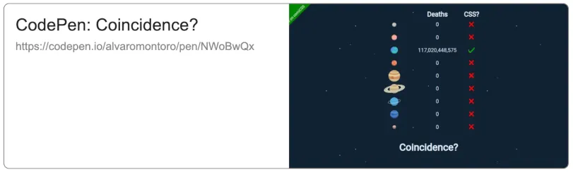
As an example, I will link one of my CodePens —A CSS joke I created for comiCSS a few weeks ago:
<a href="https://codepen.io/alvaromontoro/pen/NWoBwQx"
   class="codepen-preview"
   data-image="https://shots.codepen.io/username/pen/NWoBwQx-800.jpg"
>
  CodePen: Coincidence?
</a>
Just with this code, this is how our CodePen link will look like:

The CSS
We will expand the experience by transforming the link from simple text to a multimedia card with CSS (all while keeping a single <a> tag). We will change it from online text to a block with text and images and consider adding animations.
For this, we will turn the link into a grid and use the ::before and ::after pseudo-elements. This way, we will be able to work with three things: the link text itself, the ::before, and the ::after.
Here is a sample of the CSS code using CSS nesting (which, in this case, will be the same as for Sass/SCSS):
.codepen-preview {
  position: relative;
  box-sizing: border-box;
  display: grid;
  grid-template-columns: 1fr 1fr;
  grid-template-rows: auto 1fr;
  gap: 0.5rem;
  width: 100%;
  max-width: 800px;
  aspect-ratio: 160 / 47;
  border: 1px solid #777;
  border-radius: 0.5rem;
  padding: 1rem;
  font-size: 1.5rem;
  font-family: Arial, verdana, sans-serif;
  color: #222;
  text-decoration: none;
  overflow: hidden;

  &::before {
    content: "";
    background: url(https://shots.codepen.io/username/pen/NWoBwQx-800.jpg);
    background: attr(data-image url);
    background-size: cover;
    background-position: center center;
    grid-column: 2;
    grid-row: 1 / 3;
    margin: -1rem;
    margin-left: 0;
    min-width: 50%;
  }

  &::after {
    content: attr(href);
    width: 100%;
    overflow: hidden;
    text-overflow: ellipsis;
    font-size: 0.65em;
    color: #888;
  }
}
With this code, we turn the link into a grid with two columns (of equal size) and two rows (one with automatic height and the other expanding to the rest of the available space). The link text will go on the top left cell; the ::before will occupy the whole right column and have the image as a background; and the ::after will be on the bottom left cell and display the link to the CodePen demo.
We could add a different data attribute and display it alongside the URL. But I won't do it to keep the demo simple for now. Feel free to add it if you want to.
Note: I truncate the
::aftertext to avoid problems with sizes. But remember what Karen McGrane comically illustrated: truncation is not a content strategy.
The Image
We store the image in a data attribute in HTML that we read on CSS. Unfortunately, the attr notation that allows to pass specific data types to CSS properties (attr(data-image url)) is not supported yet. That's why we have a second background property with a fallback value.
/* this property will only work... */
background: url(https://shots.codepen.io/username/pen/NWoBwQx-800.jpg);
/* ...if the value for this property is incorrect/not supported */
background: attr(data-image url);
This way, if the browser doesn't support attr(data-image url) (most browsers won't), it will pick the first background instead. Also, note how I have put the same URL in data-image and in the fallback. This is good for this demo but not great if we want to make this a generic component. We should use a generic picture as a fallback.
Alternatively, we could use CSS custom properties instead of data attributes:
<a href="..." style="--preview: url(path-to-thumbnail)">...</a>
background:
  var(--preview),
  url(path-to-default-fallback-image);
Notice how we can stack multiple backgrounds to avoid problems with missing images. The code above will render the preview on top of the fallback, which will only be visible if the preview image fails (or has transparency).
Note: Stacking backgrounds would not work with
attr(data-image url)because, as it is not supported, the whole property would be considered invalid and dropped. Leaving our link without an image (custom or default). That's why we need two background properties when using theattr()method.
This code could be more generic and considerably simplified if CSS supported some form of string concatenation combined with the functions (and especially the url() method)... but CSS is not there yet.
Interactivity
So far, the card is relatively static. Apart from the outline on focus, there's nothing "attractive" about it. We can improve that by changing the border and text color on hover and by animating or zooming on the image. We could achieve that with the background-size property or with object-fit —depending on how we imported the image; in our case, background-size will do.
.codepen-preview {
  transition: background 0.25s;
  /* ... */

  &::before {
    background-size: auto 100%;
    transition: background-size 0.5s;
    /* ... */
  }

  /* ... */

  &:hover {
    border: 1px solid #555;
    color: #000;
    background: #f0f8ff;

    &::before {
      background-size: auto 110%;
    }
  }
}
Multiple things are going on in this code:
- It adds a transition to the main element's background, so when we change the color, it won't be a sudden change but a progressive one.
- It replaces the size on the thumbnail image from
covertoauto 100%. This is because we want to add transitions to thebackground-sizeandcoveras a value cannot be animated. Be careful with the value you pick here; it will depend on the size of the card and the size of the image, and we want to avoid repetitions. - On hover, it changes the color of the card's text, border, and background (which will be progressive, thanks to the transition we added in the first point).
- Also, on hover, it changes the
background-sizeof the thumbnail image toauto 110%. That extra 10% is a small value, but it will create a nice effect when associated with the transition.
Notice how we added different times for the transitions. Having all the movement and changes starting and finishing simultaneously creates a "fake experience." That's not how things work in real life. This may not be the best example as the difference is negligible, but people realize when the animations and transitions are too "robotic." We could even consider a small transition-delay (which could be different at rest and on hover).
Accessibility
Because it is still a link and we didn't remove the outline, the element will get a visible indicator when it is focused. Please don't remove outlines.
As we added interactivity with zoom and movement, we may want to consider adding a "prefers reduced motion" rule, allowing us to specify styles for users who have selected the "reduce motion" setting on their computers.
@media (prefers-reduced-motion) {
  .codepen-preview,
  .codepen-preview::before {
    transition: none;
  }
}
Remember that the goal is not necessarily to remove the animations altogether (as I just did). We could make the animations and transitions smoother and softer so everyone gets an enhanced experience.
In our particular case, the color transition is soft and shouldn't be an issue. The motion we added is not excessive, but it is non-essential, and it is the type of zoom effect that could cause trouble for people with vestibular disorders. We can change it instead with a soft filter:
@media (prefers-reduced-motion) {
  .codepen-preview:hover::before {
    filter: brightness(0.75);
    background-size: auto 100%;
    transition: filter 0.5s;
  }
}
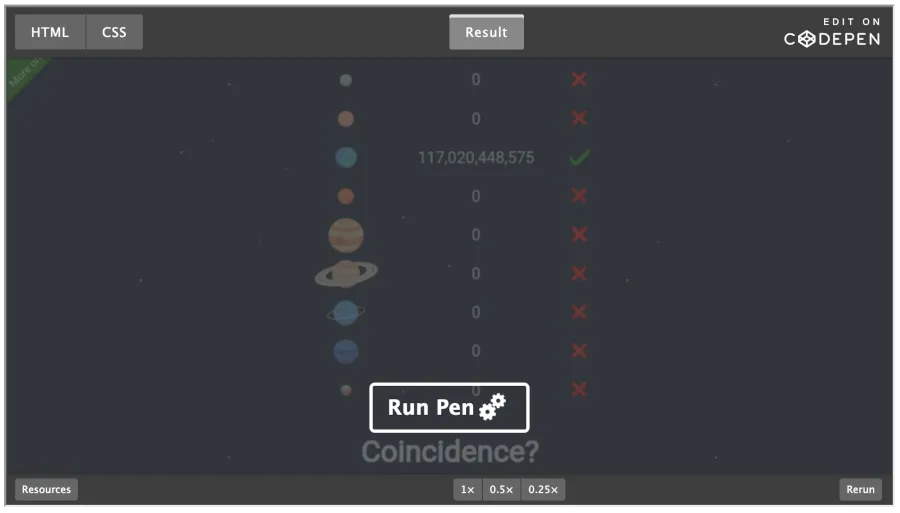
The result after applying the CSS looks like this:
The JavaScript
Finally, if JavaScript is enabled and our script is loaded, we take the links (selecting them by the class we added) and replace them with an iframe that points to the CodePen embed page.
const codepenDemos = document.querySelectorAll(".codepen-preview");

for (let x = 0; x < codepenDemos.length; x++) {
  const codepen = codepenDemos[x];
  const iframe = document.createElement("iframe");
  iframe.style = "width: 100%; aspect-ratio: 16/9;";
  iframe.setAttribute("title", codepen.textContent);
  iframe.setAttribute("allowfullscreen", "true");
  iframe.setAttribute("loading", "lazy");
  iframe.src = codepen.href.replace("/pen/","/embed/preview/")
                           .replace("/details/","/embed/preview/")
                           .replace("/full/","/embed/preview/")
                           .replace("/live/","/embed/preview/")
                           .replace("/debug/","/embed/preview/");

  codepen.replaceWith(iframe);
}
This script searches for all the elements that have the class that we added to the links that we wanted to enhance (remember to make it specific enough not to select too many things!), then creates an iframe based on the link content and attributes, and replaces the link with that iframe (yes, we change the page code, but at this point, it's ok as we know we have JavaScript enabled and loaded).
We add several additional attributes to the iframe to provide a more user-friendly experience:
-
title: this will help identify the iframe to the browser and assistive technologies. -
loading: with the valuelazy, it will load the content of theiframein a non-blocking way that will improve performance. -
allowfullscreen: it allows the content of theiframeto go into fullscreen mode (self-explanatory).
After running the script, our link is not a link anymore. It is now an iframe that contains an interactive version of our CodePen, and we are done:
Conclusion
I applied this method to CodePen, but it could be used on other sites. Any that you want, although it would work better with platforms that provide some thumbnails for you to use.
Here's a live demo on CodePen with all the code and the different stages:
Note: To showcase the different steps, I had to change the selectors for the demo. Beware if you copy-paste the code as it may not work as-is.
I hope you liked the article. Let me know if you have developed something like this or if you use this article as a guideline for a similar component. I enjoy seeing what people create online.