

They say the small things will make or break relationships. That is true, especially for web development, where a simple line of code may make a difference and improve the user experience and the visitors' connection with your website.
In this article, we will review five small things that require a line or two of code and that will improve how users perceive your website. Some of them may not make a substantial positive impact, but their absence may have a negative one. Don't underestimate them.
These are the small details explained in this article:
- Theme colors
- Accent colors
- Input types
- OpenGraph
- Text-Wrapping
1. Theme Colors
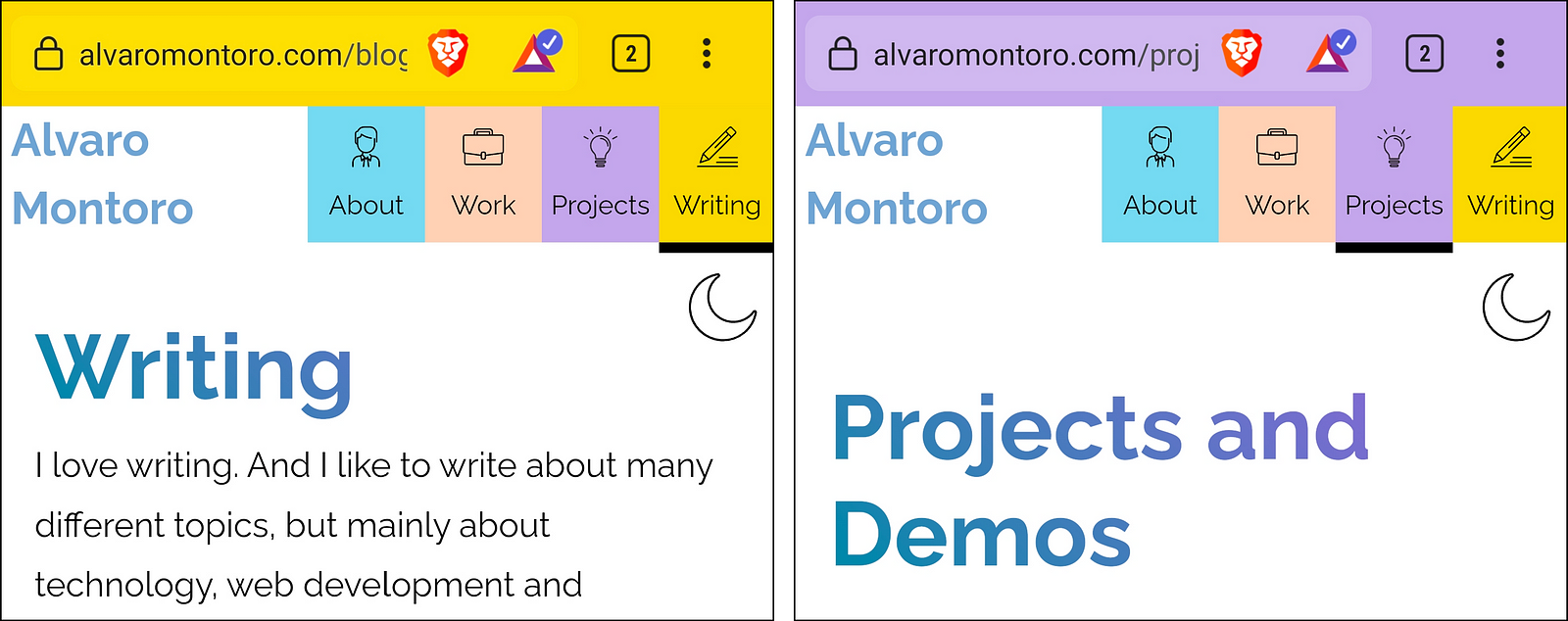
The theme-color value suggests a color browsers should use to customize their display while navigating the site. This means adapting the browser colors to match the specified theme color. For example, change the address bar color in a mobile browser or the default background color in a desktop browser.
This is more of a mobile feature, although it's coming to desktops, too. Currently, it is supported by Safari and Chromium browsers on mobile and Safari on desktop (with Chrome behind a flag). And it is super easy to implement using a <meta> tag:
<meta name="theme-color" content="#f00" />
I already demoed this trick when creating a clone of a McDonald's app. Then, I needed the top bar to be dark because the game was supposed to be used in a dimly lit room.
How does it improve the experience?
We can create a sense of continuity and uniqueness by associating one color with our websites (and getting away from the norm and default toolbar colors) or associating colors with sections, providing a more fluid experience.
This last part is a small detail I use on my personal website. The top menu has colored buttons for each section, and when navigating the site, the theme color is changed to match the selected option. That way, my menu options are tabs that flow into the address bar, highlighting the current option.
Extra trick
The theme-color doesn't have to be unique within the page. It can be personalized using the media attribute to change colors depending on the browser's/computer's configuration.
<!-- theme color is white unless in dark mode, then it's black -->
<meta name="theme-color" content="#fff" />
<meta name="theme-color" media="(prefers-color-scheme: dark)" content="#000" />
2. Accent Colors
Your website will have a palette and set of colors, and in the middle of it, suddenly, there's an input with a different native color. It looks out of place and breaks the experience. Design systems help with this, but not every site will have a design system or a framework that deals with this type of thing.
Browsers provide a default UI for some form controls like checkboxes and radio buttons. This is good. We don't have to worry about designing something ourselves, but we didn't have much control over them style-wise unless we wanted almost entirely to rebuild them.
The accent-color property comes to the rescue! With accent-color you can specify the predominant color for checkboxes, radio buttons, ranges, and even progress bars.

How does it improve the experience?
Consistency and accessibility. The scenario described above is a perfect example. We want our form controls to be consistent with the UI and colors of the whole site and accent-color does precisely that. Apart from that, we would get some cross-browser consistency as all browsers would display the controls with the same colors (instead of blue in Chrome, black in Edge, etc.)
Additionally, one perk of accent-color is that browsers automatically adjust some of the UI to make the component accessible. For example, the checkmark in a checkbox will be black or white, depending on how light or dark the accent-color value is. There is no risk of making mistakes and needing more contrast between checkmark and background.
3. Input Types
Everyone is familiar with text inputs, radio buttons, and checkboxes, but HTML has 22 different input types (plus a deprecated one) that developers can use. Most of them will look like regular text inputs but offer additional functionality that should not be overlooked:
- number
- date
- color
- tel...
Browsers provide validation, entry conditions, and even unique controls and popups for these inputs. Simplify your visitors' lives and your own life: delegate on the browser instead of coming up with over-engineered solutions for things that are available natively.
How does it improve the experience?
This is one of those things that, if it's there, visitors may not notice, but if it's not there, they will be annoyed by it. I wouldn't say I like typing a whole date and getting an error because the format is incorrect.
The sentiment is even stronger if something like that happens on mobile: tap on the field, change the keyboard from letters to numbers, enter part of the date, go to the symbols keyboard, add more digits, then go back to the symbols, and back again to the numeric keyboard. That's a hassle that your visitors shouldn't have to go through. Mobile devices do a great job of showing different keyboards depending on the type of input.
On top of that, and as mentioned in the previous section, browsers provide many functionalities out of the box, like field validation: letters cannot be entered into the date or number field, the color picker has a nice display, email fields check the format, etc.
Extra trick
In mobile, you can get a somewhat similar effect to the different keyboards for each type of input, but on textarea and elements with contenteditable. The trick is using the property inputmode and specifying the type of keyboard you want to display: numeric, telephone, email, etc...
<textarea inputmode="url"></textarea>

<div contenteditable inputmode="decimal"></div>
4. Open Graph
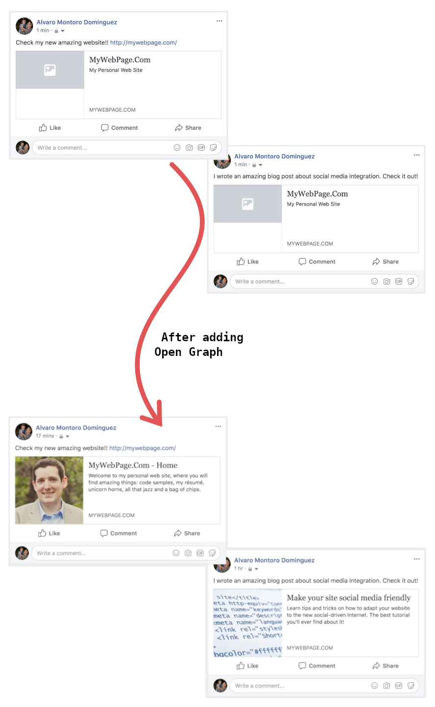
This change won't affect your website visually but will impact how other websites display your page when it is shared (mainly social media sites). As a developer, you want to have control of those things, and that's where OpenGraph and the social media tags (Twitter has its own) come along.
With OpenGraph, you can specify many things:
- The image to display on the card.
- The title
- The description
- A short video (creates cool effects on Skype)
- A piece of audio associated with the site
- The website's color...
The code is straightforward, and it would go into the page's <head>. Here is an example (there are more):
<meta property="og:type" content="website">
<meta property="og:title" content="Page Title">
<meta property="og:description" content="Description of the page.">
<meta property="og:url" content="link.to.be.displayed.when.shared">
<meta property="og:image" content="link.to.thumbnail.image">

<meta name="twitter:card" content="summary">
<meta name="twitter:title" content="Page Title">
<meta name="twitter:description" content="Description of the page.">
<meta name="twitter:url" content="link.to.be.displayed.when.shared">
<meta name="twitter:image" content="link.to.thumbnail.image">
As web developers, we must holistically care for our product (the website). It's not just a matter of writing code to look good to the visitor; it's a whole experience that includes other sites like Facebook, Twitter, or LinkedIn.
How does it improve the experience?
As mentioned above, this will not impact your website; it changes how other websites "see" your website. The additional text they must load has the most significant impact on your visitors (and it is a negligible value.)
Social media and professional websites will lead traffic to your site as your content is shared. But if it looks poorly, people will feel less attracted to clicking on it. Open Graph allows you to personalize how your content will be shared. Please take advantage of it. Visual content is more memorable than just text. Add catchy images! There's a sentence in the article that you want to highlight? Add it to the description!
Extra trick and a warning
Open Graph is great for personalizing your website for social media. Other technologies will make your website easier to process and identify for machines (like search engines or web crawlers). Using Microdata to boost the semantics of your HTML code is an excellent example, although the gains may not be as visible as with the other tricks.
And a word of caution: do not just set the Open Graph values for your whole site and move on. That will lead to problems later as all the pages will be identified as the same on social media (some websites are smarter than others at processing this data). The values should be page-specific and should be updated when navigating between pages.
5. Text-Wrap
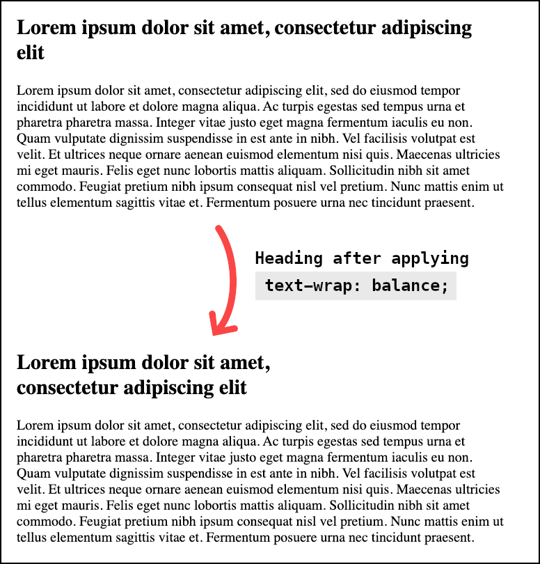
This is a practical trick for text, especially for titles and headings. How often have you written a title only to find it looks poorly once rendered? It could have two long lines and a tiny one or a long word, breaking the line oddly. The property text-wrap can help with that!
text-wrap tells the browser how it should wrap the text inside the element. And the value that interests us in particular is balance, which will balance the text so when it wraps into multiple lines, they all have more or less the same width, making it look... well... more balanced
How does it improve the experience?
Having balanced text improves readability. A high density of text is tiring (and looks like the dreaded wall of text), and a low density can make it difficult to follow the text (e.g., when we have a long line followed by a short one).
Balanced titles are going to be easier to read, and they are going to be more visually appealing. A win-win for text-wrap. The main issue with this method is that it's not well supported by all browsers yet. Still, it's getting traction, and Chromium browsers support it, so now may be the perfect time to start using it.
Extra trick
While text-wrap: balance is a big hype online at the moment as it's getting more and more support; there is another interesting value that will be landing (eventually) on all browsers: pretty.
Sometimes, you write a heading, and only one word falls into the new line. That doesn't look great, and balancing the text may not be a good option either. One solution would be to move one more word to the new line. That way, there won't be a single word in the line.
Unfortunately, at the moment of writing this article, the value pretty is not supported by any browser.
Cover photo by Brooke Cagle on Unsplash