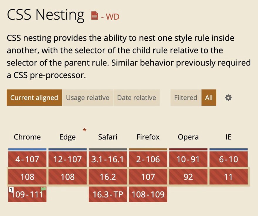
Browsing caniuse.com the other day, I found a pleasant surprise: a little green flag in a red box for a feature I'd been waiting for a long time.
CSS nesting will soon be supported on Chrome:

Yes, it's behind a flag and only in future versions, but it is a huge step forward. Those versions will soon be available, and we can try it locally (unfortunately, not on production without a polyfill or a plugin).
I can't wait for the table above to slowly start turning green. It will be big and could, little by little, reduce the dependency on libraries like Sass or Less. (Nothing against them, but it would be nice to have some of that behavior natively... I can only dream of having loops and functions one day.)
Not everyone shares my excitement. After sharing a post about this on social media, I quickly got some replies indicating that the nesting is no more than some syntactic sugar or not a significant improvement.
While it is true that it can be seen as syntactic sugar —some of the things we can achieve with CSS nesting can be achieved with combinators, too—; the critical part here is the "some" part. We can do some things with CSS nesting that cannot be done with combinators (e.g., styling pseudo-elements).
And even if we consider CSS Nesting syntactic sugar, where is the problem? Anything that helps organize the code, making it more robust, portable, and maintainable, should be welcomed. And that's what CSS nesting does: it allows grouping and encapsulating styles (in a similar way to how Sass or Less do it), and that will reduce common errors caused by poor code architecture/organization (like when people complain that changing a style in one page affects the styles on a different page.)
What is CSS Nesting?
This article was not intended to be a deep dive into CSS Nesting, more of an informational thing. The module is going through major updates and the notation displayed below may not match the final notation. If you want to learn more about CSS Nesting, check the W3C Editor's Draft, or Kilian Valkhof's article on CSS Nesting and Specificity.
With CSS Nesting, we can place one CSS rule inside of another (nest rules), and the selector of the child rule will be relative to the selector of the parent rule.
This is helpful for the modularization and maintainability of the code. Things that were exclusive to CSS preprocessors are possible in a native way.
Let's imagine that we have this code in CSS:
.blog-post {
  margin-bottom: 3rem;
}

.blog-post .large-paragraph {
  font-size: 1.5rem;
}

.blog-post .large-paragraph a {
  text-decoration: underline;
}

.blog-post .large-paragraph a:hover {
  text-decoration: wavy underline;
}

@media (min-width > 1024px) {
  .blog-post .large-paragraph {
    font-size: 2rem;
  }
}
With CSS Nesting, we can nest the children making the code more organized. In a similar fashion to what CSS preprocessors like Sass or Less do:
.blog-post {
  margin-bottom: 3rem;

  .large-paragraph {
    font-size: 1.5rem;

    @media (min-width > 1024px) {
      font-size: 2rem;
    }

    a {
      text-decoration: underline;

      &:hover {
        text-decoration: wavy underline;
      }
    }
  }
}
Both ways will translate into the same CSS code for the browser. So there won't be any difference between the two.
Specificity
There will be some differences when calculating the specificity, especially when there is more than one selector in a rule:
article, .blog-post {
  & .large-paragraph {
    font-size: 1.5rem;
  }
}
That code above will be equivalent to the following:
:is(article, .blog-post) .large-paragraph {
  font-size: 1.5rem;
}
Because it is equivalent to an :is(), the larger of the specificities will be used in the &. This may lead to confusion. For example, in the code above, an article with a .large-paragraph will have the same specificity as two classes instead of one class and one element.
Ideally, that won't be a big problem because our CSS will be more modular, and we won't find unpleasant surprises.
As mentioned above, this module is hot, and the specification is constantly updated. When writing this article, the latest draft is less than a month old, and many changes are still coming. So the notation displayed in this article may change. For example, just a few weeks ago, there was a big poll to gather information from developers and decide on the best syntax to move forward (spoiler alert: option 3 won). Also, the @nest at-rule has been dropped in the latest versions of the draft, one reason why it was not mentioned.
I believe this technique will be beneficial for organizing code and avoiding human errors, and I can't wait until it is available in all browsers.

