
This is how the process went (more or less):
First, I created a container that would work as a canvas (painting canvas, not HTML <canvas>) and set the stage by adding styles that apply to all the elements inside this container.
Then I added an ellipse for the body, something simple:
.body {
  width: 80%;
  height: 60%;
  background: #369;
  border-radius: 50%;
  top: 50%;
  left: 0;
  transform: translateY(-50%);
}
Later I would update some of those values to make the body have different colors. You can check the source code on CodePen for more details.
The next step was adding elements into the body: eyes, mouth, cheeks, gills, tail, fin...
To make it look kawaii, I needed large rounded eyes with a spark in them and, for the mouth, a semicircular line in between—also, some elliptical pinkish cheeks right below the eyes.
.eye {
  width: 8%;
  aspect-ratio: 1;
  border-radius: 50%;
  top: 45%;
  left: 4%;
  background: radial-gradient(circle at 32% 32%, white 14%, black 0);
}

.eye + .eye {
  left: 35%;
}

.mouth {
  border-radius: 50%;
  border: 0.5vmin solid #0000;
  border-bottom: 0.75vmin solid #000;
  border-left: 0.75vmin solid #000;
  width: 10%;
  aspect-ratio: 1;
  top: 50%;
  left: 18%;
  transform: rotate(-45deg);
}

.cheek {
  width: 10%;
  height: 7%;
  background: #fcc6;
  border-radius: 50%;
  left: 3%;
  top: 57%;
}

.cheek + .cheek {
  left: 34.5%;
}
The fin was easy: an element with one side having 100% border-radius while the others had 0. That way, it had the typical shape of a shark fin. I would reuse that shape later for the tail and flippers, too! Changing the size and transformations (rotations and skews) would make them different enough.
.fin {
  border-radius: 100% 0 0 0;
  background: #369;
  width: 25%;
  height: 35%;
}
Finally, I added a filter to the body element (not the <body> tag) with multiple drop-shadow() so there would be a more or less consistent border all around the shark.
The background was an easy change too. In the video version, I just had a plain light green color. Later, I added a couple of additional backgrounds to simulate sunshine rays and a gradient from lighter (surface) to darker (sea depths).
Here's a video with a time-lapse of the process:
Adding more details
I stopped with the recording but later returned to the drawing and decided to add a little detail to it:
- Shadows at the bottom
- Lighter parts at the top
- Some texture on the cheeks
- Add a nicer background
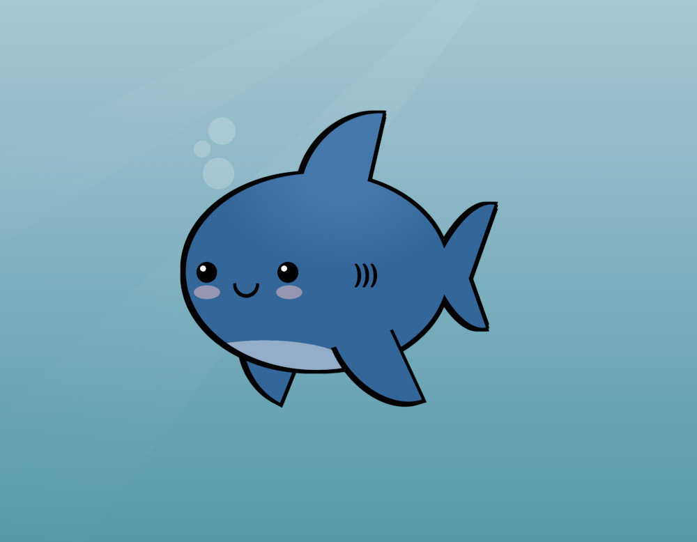
Just with those small things, the illustration gained a lot. It really is the small details that make or break something. Here's the CSS drawing:
Variations
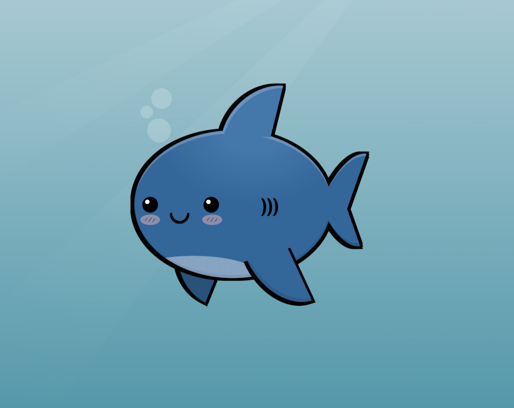
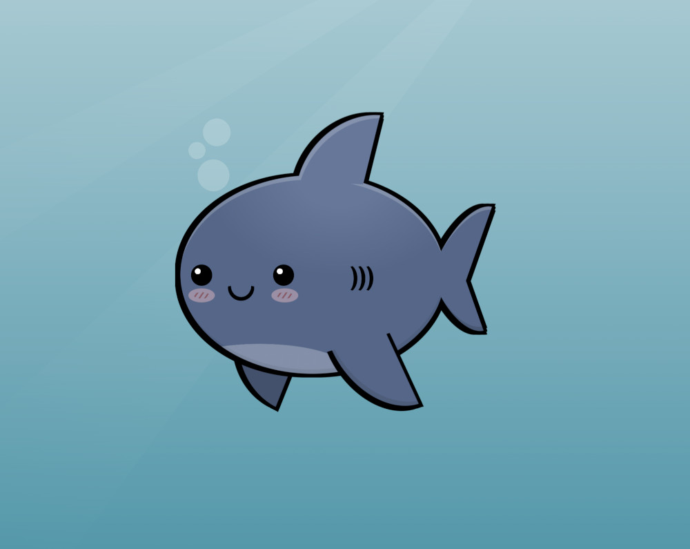
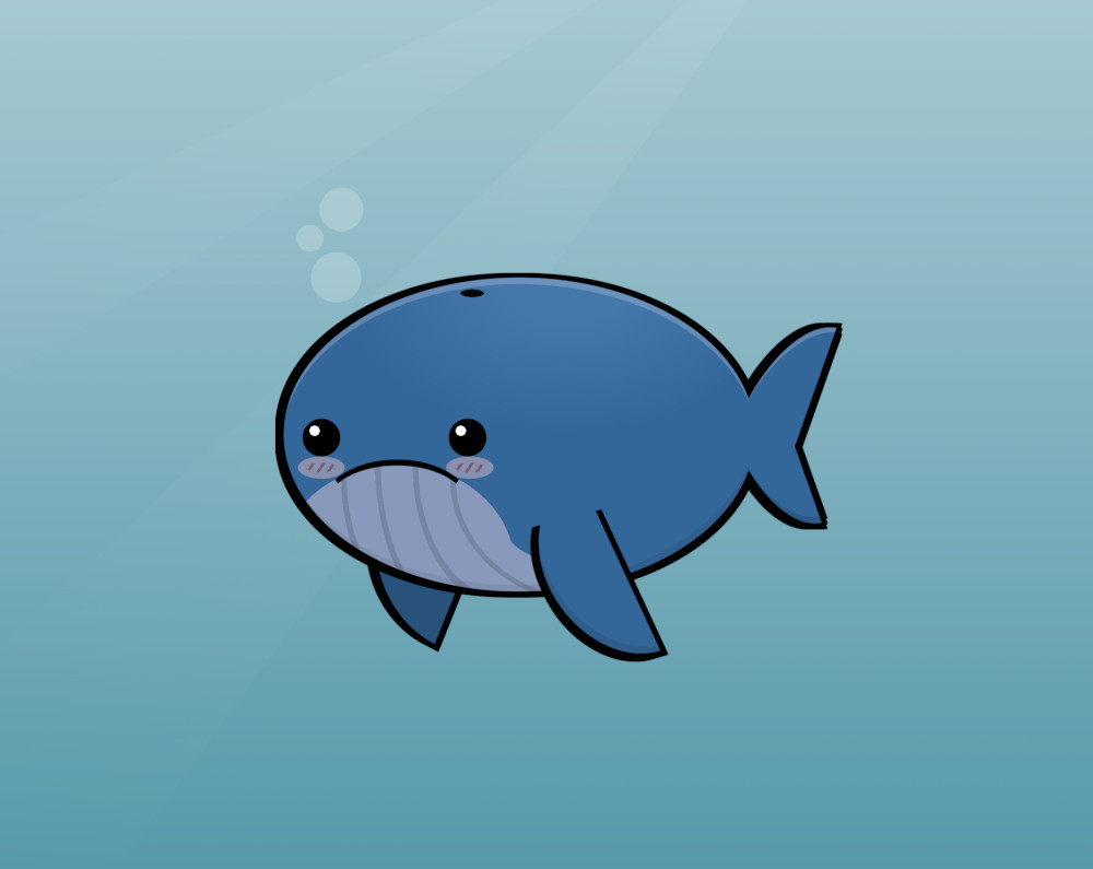
Because it is code and uses variables/custom properties, it is relatively easy to customize and transform into different versions. These are some variations of the drawing with minimal code changes.
A great white shark (same shark, but in gray):
A blue whale (larger, no fin, different body background):
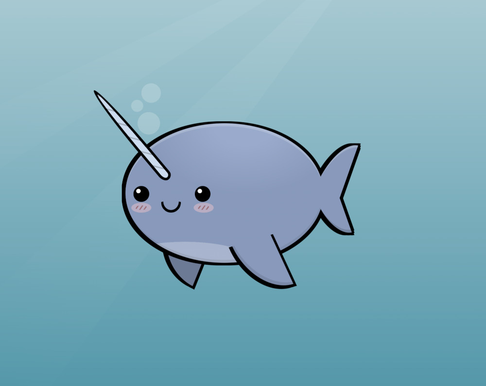
A narwhal (lighter color, no fin, and a tusk):
I liked how they looked, so I showed them to my children. They looked at the screen for a second and said, "Meh! They look like they are fish... too fishy." Kids have a way of keeping us humble.
If you liked this content, check my YouTube channel, where I have more drawings and videos with CSS tips and tricks.