
It has been snowing and freezing in Texas lately (it still is)... and that was the inspiration for this quick animation of snow falling done with HTML and CSS in less than 10 minutes (video at the bottom of the post).
Note: we used Pug and Sass/SCSS to simplify the repetitive parts of HTML and CSS respectively, but they are not needed. You can extrapolate the code so it's only HTML and CSS (for simplicity, we will show both in the article.)
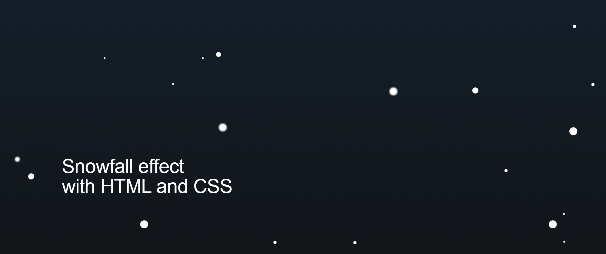
This is how our animation will look in the end (demo via CodePen):
Setting the background
Let's start by setting up the background. This step is optional and can be done in multiple ways. For demo purposes, we will just limit ourselves to making a dark background with CSS:
html, body {
  padding: 0;
  margin: 0;
  width: 100vw;
  height: 100vh;
  position: relative;
  overflow: hidden;
  background: linear-gradient(#123, #111);
}
Adding the snowflakes
Then we will create a <div> for each snowflake that we want on the screen. We could do something like this:
<div class="snowflake"></div>
...
...
...
<div class="snowflake"></div>
<div class="snowflake"></div> <!-- 50 times! -->
But for simplicity, we used PugJS that allows us to use loops for these repetitive tasks:
- for (i = 0; i < 50; i++)
  div(class="snowflake")
Styling the snowflakes
We now have all the snowflake <div>s on the page, and we need to style them. They will be small, rounded, and white:
.snowflake {
  --size: 1vw;
  width: var(--size);
  height: var(--size);
  background: white;
  border-radius: 50%;
  position: absolute;
  top: -5vh;
}
We used a custom property (--size) for the width and height because it will be convenient later when we want to have different sized snowflakes.
Also, we positioned the snowflakes outside of the view frame (from the top). We will make them fall to the outside of the view frame (from the bottom).
Adding the animation
To animate this fall, we need to use a CSS animation with @keyframes. We are going to start with something basic and then make it grow a little.
First, we will use translate3d to make the snowflakes move vertically. Because it is a 3D transform, it will trigger the hardware acceleration and look nicer than if we animated a different property like top:
@keyframes snowfall {
  0% {
    transform: translate3d(0, 0, 0);
  }
  100% {
    transform: translate3d(0, 110vh, 0);
  }
}
We could apply this animation to the snowflake class by adding this property:
animation: snowfall 5s linear infinite;
But that would only move the snowflakes vertically from top to bottom and look unrealistic. Plus, all the snowflakes are overlapping because of the absolute positioning, which is not a good look. We need to fix that.
We could create 50 different rules, one for each snowflake, assigning each of them a different left position, angle, speed... but while that would be possible in plain CSS, it is really tedious:
.snowflake:nth-child(1) {
  --size: 0.6vw;
  left: 55vw;
  animation: snowfall 8s linear infinite;
}

...

.snowflake:nth-child(49) {
  --size: 1vw;
  left: 78vw;
  animation: snowfall 7s linear infinite;
}

.snowflake:nth-child(50) {
  --size: 1.5vw;
  left: 20vw;
  animation: snowfall 10s linear infinite;
}
It is easier to code with SCSS and its functions and then use the generated CSS code. So instead of having to write hundreds of lines of code, we can use loops to simplify considerably the development:
@for $i from 1 through 50 {
  .snowflake:nth-child(#{$i}) {
    --size: #{random(5) * 0.2}vw; /* randomize size! */
    left: #{random(100)}vw;
    animation: snowfall #{5 + random(10)}s linear infinite;
  }
}
Boom! That's 7 lines of code that will be later compiled into 250! And we don't have to worry about coming up with random numbers because SCSS provides the random() function for that.
Final touches
The snowflakes have different sizes and they move at different speeds, but they are still moving just vertically, which is not too realistic. We can combine CSS variables with the SCSS functions to add some random lateral movement:
/* uses CSS variables to determine initial and final position */
@keyframes snowfall {
  0% {
    transform: translate3d(var(--left-ini), 0, 0);
  }
  100% {
    transform: translate3d(var(--left-end), 110vh, 0);
  }
}

@for $i from 1 through 50 {
  .snowflake:nth-child(#{$i}) {
    --size: #{random(5) * 0.2}vw;
    --left-ini: #{random(20) - 10}vw; /* random initial translation */
    --left-end: #{random(20) - 10}vw; /* random final translation */
    left: #{random(100)}vw;
    animation: snowfall #{5 + random(10)}s linear infinite;
    animation-delay: -#{random(10)}s;
  }
}
As a final touch, we added a negative animation-delay, so not all the snowflakes started the animation at the same spot. Otherwise, all of them would start falling at the same time and look a bit weird.
Update: Move variables to HTML
The code above is ok, but it generates a lot of CSS rules that are repetitive, just changing a small value. It is possible to simplify that into a single property (or two) directly in the .snowflake class and use CSS variables for each element.
The idea is moving the declaration of the CSS variables from the CSS to the HTML:
<!-- 1 -->
<div class="snowflake" style="--left: 69vw; --left-ini: -4vw; --left-end: 0vw; --speed: 8s; --size: 0.4vw; --delay: -10s;"></div>
...
...
...
<!-- 50 -->
<div class="snowflake" style="--left: 83vw; --left-ini: 5vw; --left-end: 1vw; --speed: 10s; --size: 0.2vw; --delay: -6s;"></div>
In PugJS, we would need to define a random function, and then use it setting values for the CSS variables:
- function random(num) { return Math.floor(Math.random() * num) }
- for (i = 0; i < 50; i++)
  div(class="snowflake", style=`--left: ${random(100)}vw; --left-ini: ${random(20) - 10}vw; --left-end: ${random(20) - 10}vw; --speed: ${5 + random(15)}s; --size: ${random(5) * 0.2}vw; --delay: -${random(15)}s;`)
Now that we have all the values in the HTML, we can remove all the CSS selectors, and just keep the animation properties directly in the .snowflake definition:
.snowflake {
  width: var(--size);
  height: var(--size);
  background: white;
  border-radius: 50%;
  position: absolute;
  top: -5vh;
  left: var(--left);
  animation: snowfall var(--speed) linear infinite;
  animation-delay: var(--delay);
}
This solution makes the CSS considerably smaller and simpler (from 500 lines to just 34!) while adding a bit more complexity into the HTML. You can see it running here. (Thanks @afif for the inspiration).
Conclusion
This is a simple animation that can be eye-catchy... but it can also be CPU-consuming if too many snowflakes are added. Use it with caution.
You can watch a video of the animation development on Youtube: