What I built
How many times have you written a tweet just to find out it's too long and it doesn't fit Twitter's limit by just a few characters? The solution is dwindling!
dwin*dle dwĭn'dl
intransitive verb. To become gradually less until little remains
With Dwindle, you can shrink the size of your tweets and make them fit into a single post. No need to register or provide any personal data. No cookies. No ads. No third-party plugins. Just you and your tweets.
Category Submission:
Random Roulette
App Link
Dwindle App: https://dwindled-plzb3.ondigitalocean.app/
Screenshots
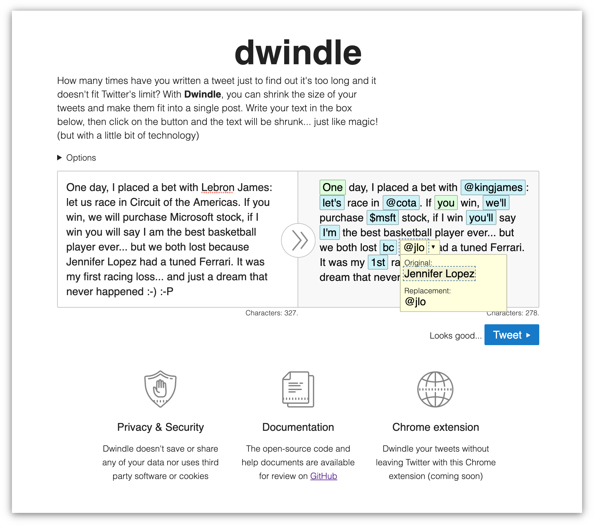
Description
Dwindle is a web app that helps to shrink the size of your text so they fit into a single tweet.
It is developed using some refreshing vanilla JavaScript, HTMl, and CSS, without any framework or library. Its main focus is on web accessibility, so everyone can use the app independently of how they use the web.
It is really easy to use:
- Write your text in the box
- Click on the Dwindle button
- Review the replacements on the result box
- Press on the "Tweet!" button
As easy as pie... hmmmm... pie...
Link to Source Code
Open source available on GitHub
Permissive License
Background
A few years back, when Twitter had a limit of 140 characters, I developed a small PHP project to help people reduce their tweets and fit in the 140-character limit.
That project was abandoned (and I lost a nice domain I had) and, although it may not make as much sense now as it made back then. I retook it for this hackathon.
New stack. New platform. New everything... I had to code the project from scratch. On the positive side, I could use it to practice some interesting articles I had found on DEV (see reference below).
But I had a couple of things clear: I had to do it right (or at least better) and solve some of the issues I faced before:
- Focus on accessibility: use semantic tags, make it screen reader-friendly, make it accessible via keyboard...
- Use better/modern practices: load data asynchronously, convert it into a PWA, make it available online...
- Provide a friendlier interface: this one is trickier because I'm not a designer, but at least make it responsive.
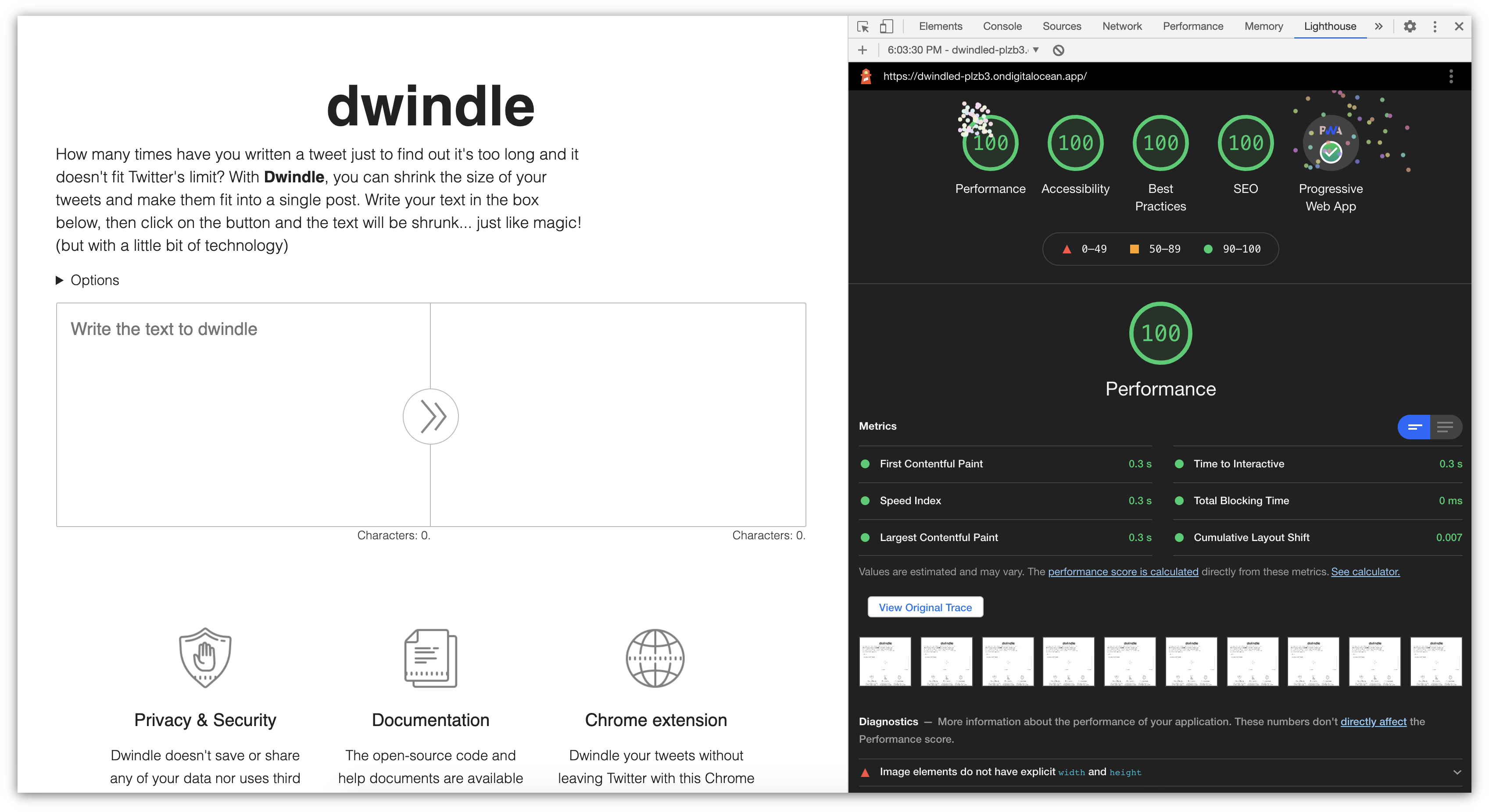
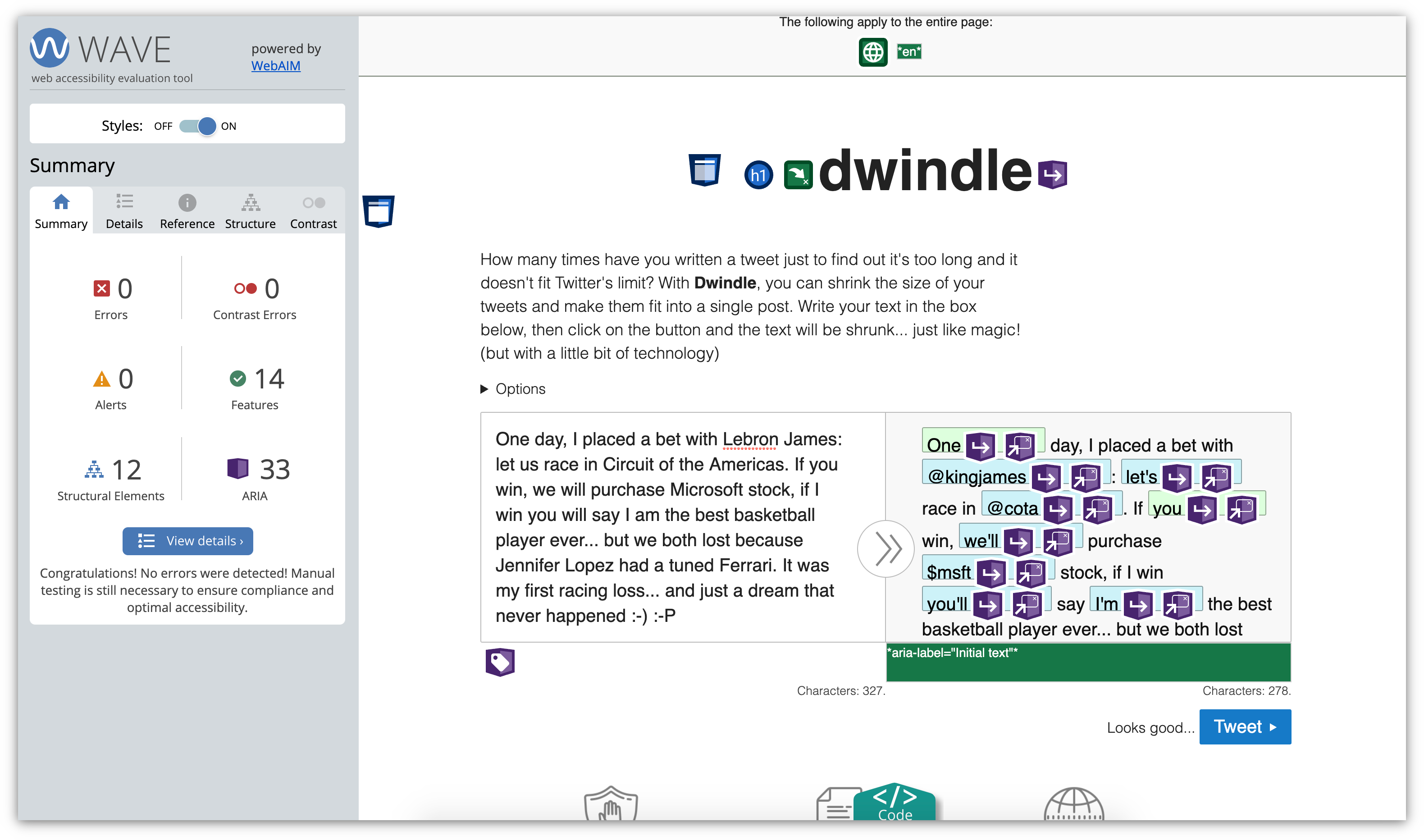
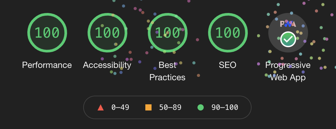
To ensure we focus on some of those. I ran Lighthouse to test performance and best practices, and Wave to verify web accessibility (apart from other tests with assistive technologies).
The results were superb:
And the accessibility tests were fine too:
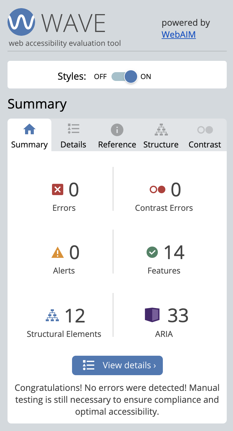
More tests were performed, especially for accessibility, making sure that the app is fully keyboard-friendly and that screen reader users would get notifications of the different actions and possibilities.
How I built it
I wrote a series of posts explaining the process and how it went. Not only coding-wise but the whole process:
- Analysis
- Research and benchmark
- Design
- Development (adding functionality little by little)
I opted to go for a simple stack with vanilla JavaScript, HTML, and CSS, without using any library or framework. It was fun to move away from the big frameworks for a change.
This project was perfect to practice some things that I hadn't done in a long time, or that I had not done before but wanted to try:
- Played with the JavaScript console.
- Converted the app into a PWA.
- Practiced keyboard interactions.
- Explored the Digital Ocean platform.
It was the first time that I used Digital Ocean and it was a great experience: I used a static site because the app didn't require much more, but the experience was really positive, and will consider trying something with PHP/Node in the future.
The integration with GitHub was amazing (I love it). Pushing changes and seeing them live seconds later? Mind. Blown. Apart from that, I got to play around with different sections (as I explain in the posts) and set alerts (although they were never triggered... which is good).
