In the previous step, we left an online app that worked but that didn't do much. Today's goals are to extend the app with more words and phrases to replace and to add some extra functionality.
Adding data
Adding new replacement dictionaries is simple now: we create the JSON file with the data, we add the category name in our app, and the code will take of the rest... the problem is finding the data!
We used the list of 100 most popular Twitter accounts and kept only the ones that had a net benefit of zero or more. Meaning, we will only replace the name for their Twitter handle if it has the same amount of characters or fewer.
For example, we will replace "Barack Obama" with "@BarackObama" because they both have the same number of characters, or "Cristiano Ronaldo" with "@cristiano " as it's 7 characters shorter. But we won't replace "Rihanna" with "@Rihanna" because it increases the count by 1 character.
One interesting case was "President Trump". I initially had it replaced by "@POTUS", but the problem is that "@POTUS" is not unique to "President Trump": before it was "President Obama" and it will change with each president's name. So I opted to use it for replacing the more generic "President of the US" or "President of the United States" (among others).
More data that could be helpful: sports teams and their Twitter handlers, countries with flags (maybe?), currencies for their simbol/code (e.g., dollar could be $ or USD), common English contractions (in the works right now)...
There are many to pick from, and not much time to implement them!
Styling
We have the replacements working, and while we add or not more dictionaries, there's something that has been bugging me: when we dwindle a text, it is difficult to identify where the changes happened:
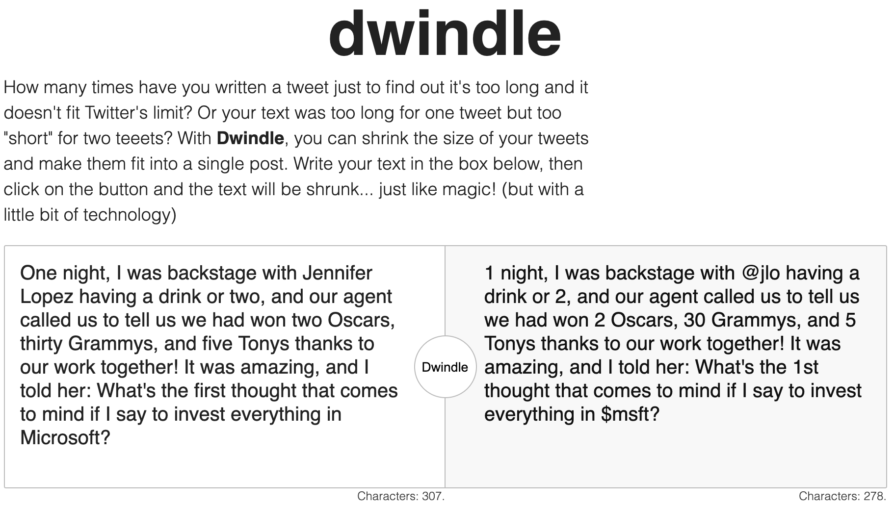
One of the main style changes would be highlighting the changes, not only because it will help identify the changes faster, but it is a perfect first step for the next update!
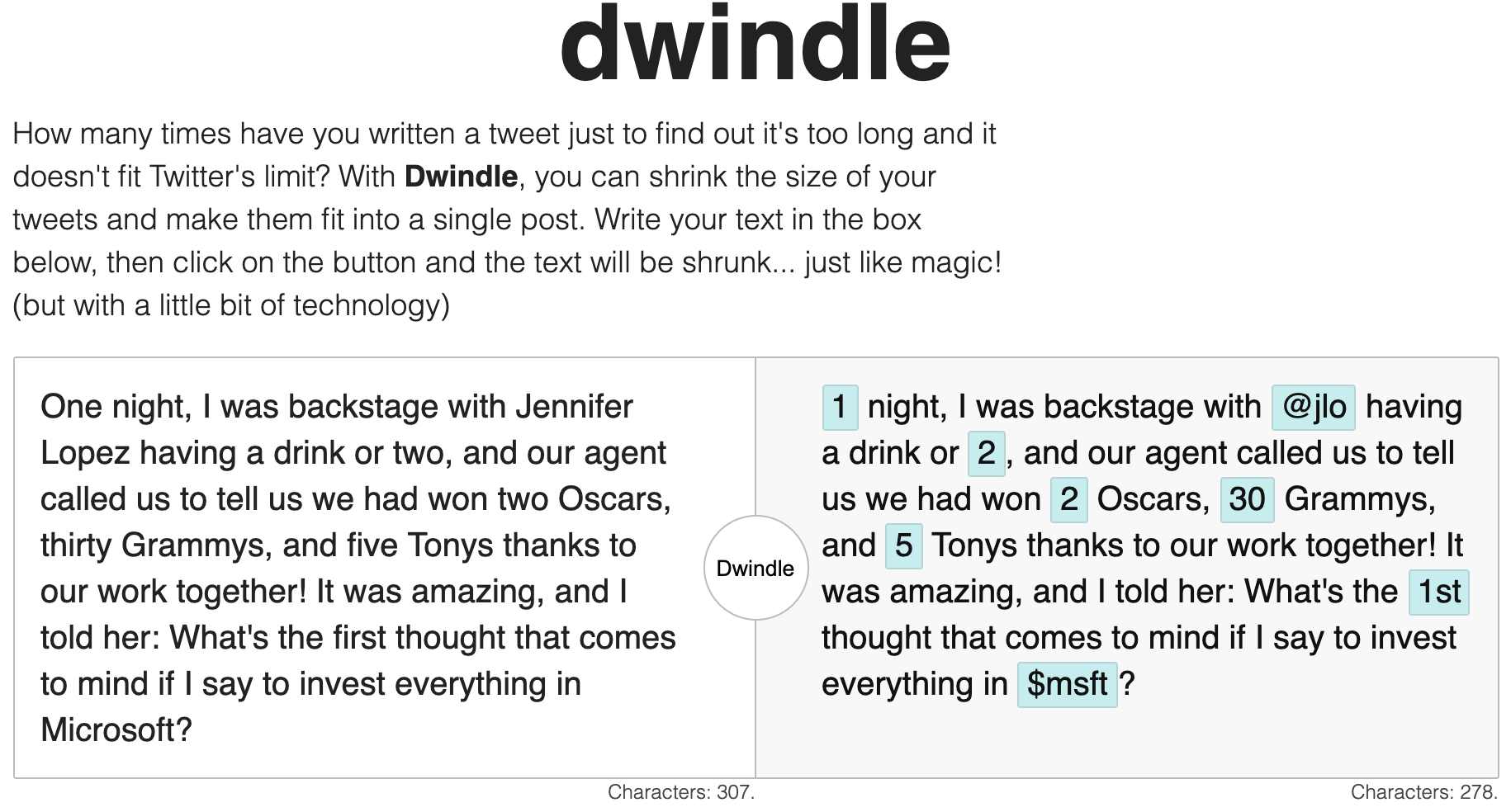
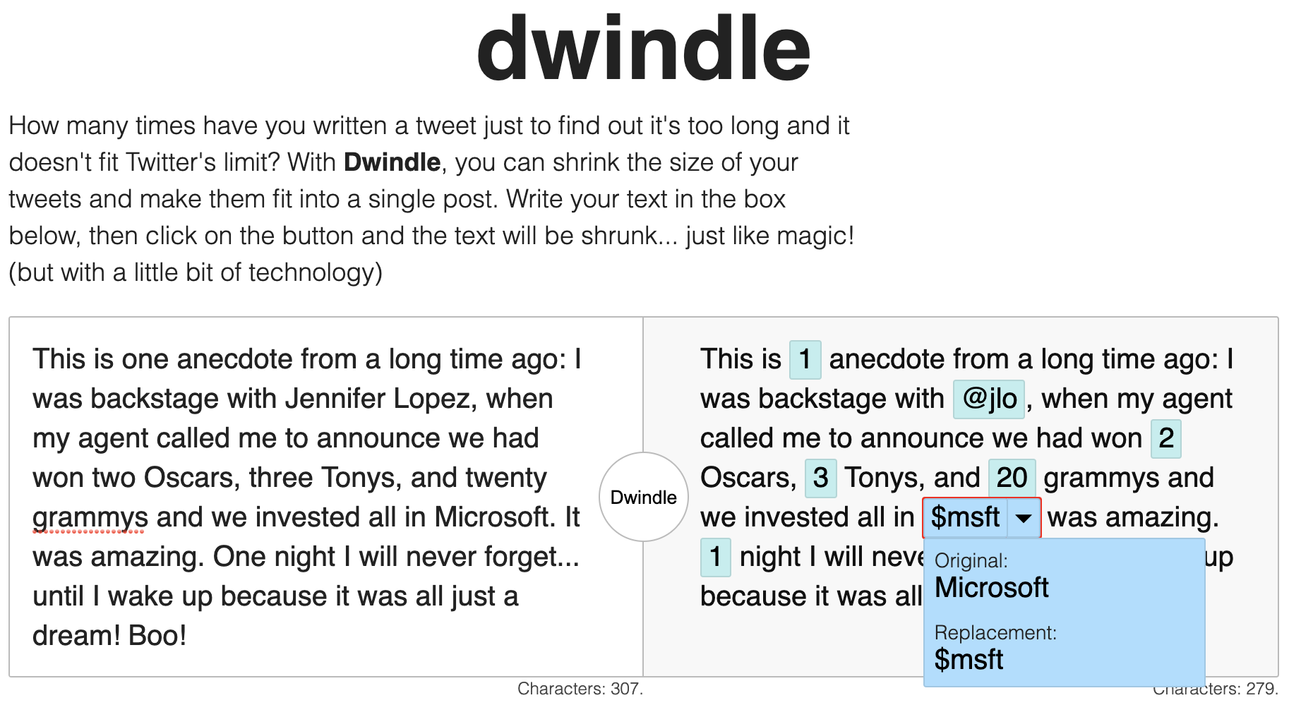
And the next step is... drumroll... allowing the users to go back to the original value instead of sticking to the replacement.
This makes sense, sometimes the replacement is too aggressive and it may make the sentence lose meaning or provide the wrong context. Also, there are cases in which we may not want to tag people and instead keep their full name.
It is important to give users the power to decide what will be replaced, instead of forcing all the replacements on them. Although that should come in a later step. Right, now I'll be happy if we can display the data in a web accessible way.
This is trickier than what it just sounds, because in order to keep it accessible, we need to make sure that the new information is reachable via keyboard and with the screen reader. Something that Wave or Lighthouse are not going to detect.
Metrics
Wave looks the same, or even a little bit better, because now there is more semantic content, so the numbers are up but errors and warnings are still at 0.
Lighthouse is tricky. After adding the information popup, the performance went down from 100 to 95
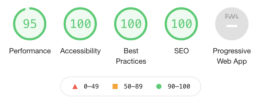
...but it depends on the screen width. I made some changes and rerun lighthouse, and got 100 in everything again:
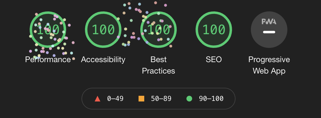
It seems that the results are a bit flaky or depend on the screen width or server. The issue that brings it down to 95 is the cumulative layout shift. I'd need to explore and investigate why that is happening... but with only 5 days left for the deadline, and it being still in the green, it won't be a top priority.
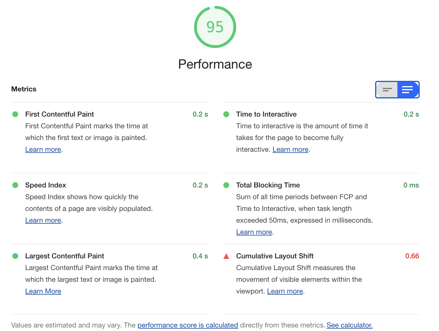
Also, it is important to notice that while I see it at 95 locally, once I upload the code to the Digital Ocean site and it runs over HTTPS, and all that jazz, the performance is back to 100 in all screen sizes.🤷♂️
Missing functionality
There are a couple of important things left to do: one is allowing users to roll back a change (as we described above), the other one is connecting Dwindle to Twitter.
I will need to revisit the Twitter JavaScript API. I would like to keep it simple and not force the user to connect/provide credentials on my site.
In the past, there used to be an URL for tweeting, if I can find it, I could use it, and activate a "Share on Twitter" button when the number of characters is less than 280.
Finally, and for extra credit, it would be nice to provide a bookmark or an extension that integrates this code with the browser and ultimately with Twitter.
The bookmark may be a bit complicated to do from a static site. It would be easier if I had PHP or any other server-side language, so I could create a mini-service.
The extension sounds like a better idea, to be honest... but it would be out of scope for the hackathon (although it would be a nice plus).
Summary of the day
Positives:
- More dictionaries
- "Colorful" and interactive results
- Popup is accessible via keyboard and screen reader
Not so positives:
- A lot of styling left to do.
- Need to connect somehow with Twitter!
- Performance went from 100 to 95 on Lighthouse.
- Only 5 days left!
