
In this post, we are going to see how to build an animated Pacman-looking pattern like this one:
As you may have noticed on the demo above, we are just using CSS without HTML or JS. (Technically, the page still has the <html> and <body> tags, but it is cool to see the HTML section all empty.)
We are going to build it using CSS gradients (linear-gradient, radial-gradient, and the less-supported-but-super-cool conic-gradient), which will help us to create patterns with the background-image property.
Setting the dots pattern
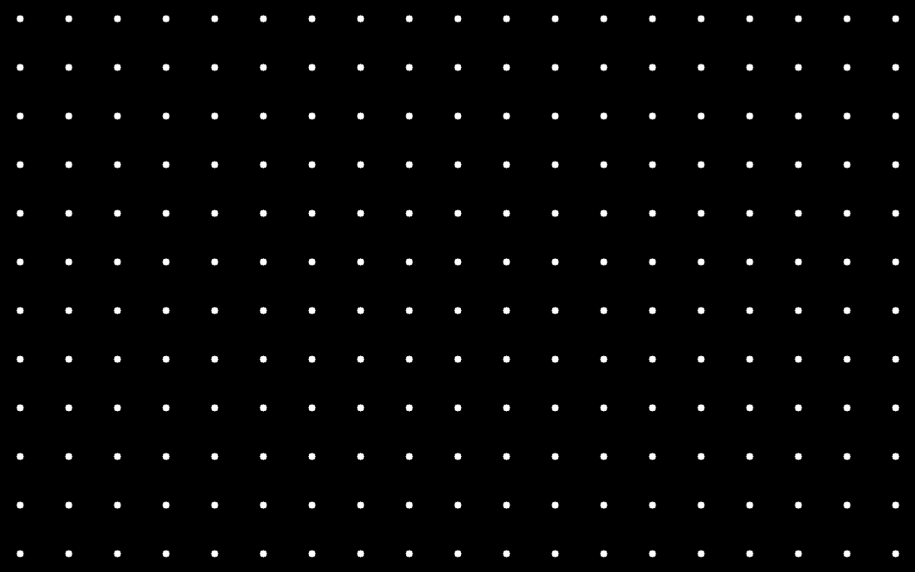
The Pacman pattern will consist of a dark background with dots all over the place. To generate the dots, we use radial-gradient and set a background-size to make sure that the pattern is small and repeated (by default) instead of only showing one big circle:
html, body {
  background-color: black;
  background-image: radial-gradient(white 10%, transparent 0);
  background-size: 8vmin 8vmin;
}
With that code, we will get the whole screen with a black background covered with white dots. Something like this:
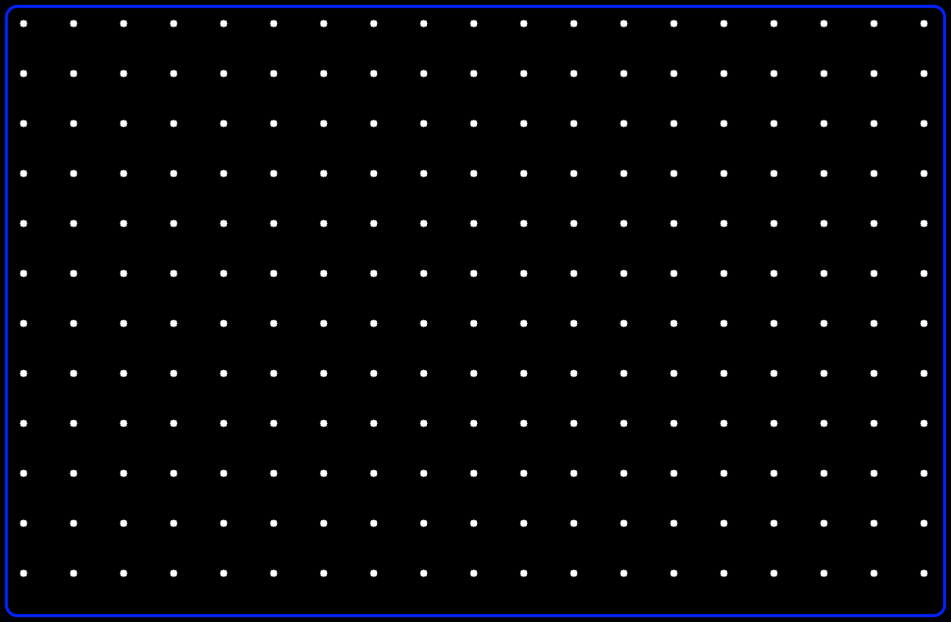
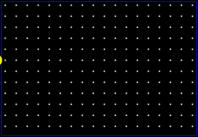
Adding a wall
We are going to add a blue wall all around the screen. The easiest way is to add a double inset box-shadow by adding this to the previous CSS rule:
  box-shadow: inset 0 0 0 2vmin black, inset 0 0 0 2.5vmin blue;
  border-radius: 3vmin;
  width: 100vw;
  height: 100vh;
  padding: 0;
  margin: 0;
The new code looks like this:
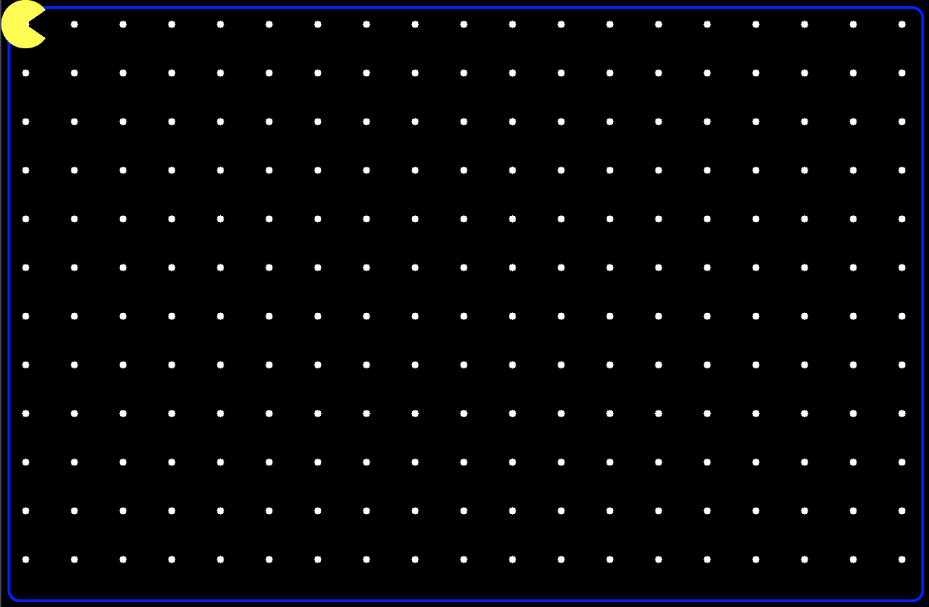
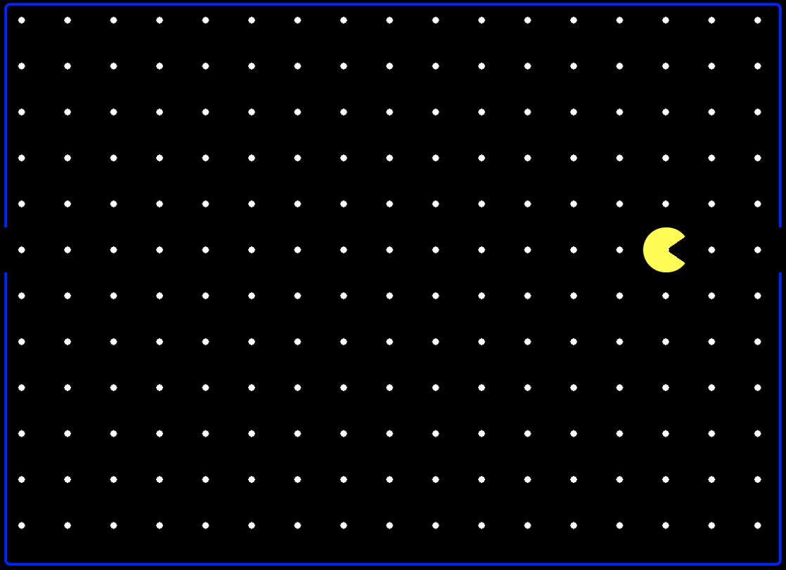
Adding Pacman
To create Pacman, we are going to use the ::after pseudo-element. We are going to make it round by adding a border-radius:50% and the mouth will be generated by using a conic-gradient:
body::after {
  content: "";
  display: block;
  top: 0;
  left: 0;
  position: absolute;
  width: 8vmin;
  height: 8vmin;
  border-radius: 50%;
  background: conic-gradient(yellow 55deg, transparent 0 125deg, yellow 0);
}
Not all browsers support conic gradients, so our Pacman may look a bit funky for some users. Instead, we could use a clip-path, which would also allow us to animate the mouth move.
With the code above, our Pacman will be at the top left corner of the screen. Change the top value to put it at a different height within the screen (use multiples of 8vmin that is the size we have used):
Animating things!
Let's start by animating the opening and closing of the Pacman's mouth. We are going to do it by replacing the conic gradient with another that is fully filled, and back:
@keyframes eat {
  0%, 50% { background: conic-gradient(yellow 55deg, transparent 0 125deg, yellow 0); }
  25% { background: conic-gradient(yellow 55deg, yellow 0);}
}
Note: to avoid annoying flickering, we use a conic-gradient that places everything as yellow instead of just setting the background to yellow.
Now we add the following property to the body::after and our Pacman opens and closes its mouth:
animation: eat 0.4s linear infinite;
As the background-image property is not animatable, it will jump from one state to another without a smooth transition. It's not great, but it will provide a vintage look.
Now let's make Pacman move from left to right. We can do that by changing the position of the background.
@keyframes movePacman {
  0% { transform: translate(-8vmin, 0) }
  100% { transform: translate(100vw, 0) }
}
CSS allows multiple animations on the same element; we need to separate them by a comma. So we update the animation property of our Pacman to accordingly:
  animation: eat 0.4s linear infinite,
             movePacman 6s linear infinite;
Which leads us to this:
Final touches
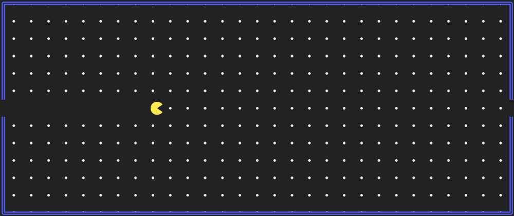
Right now, our Pacman is going through walls and on top of dots without really eating them. Let's fix that with a couple of changes:
Breaking the walls
We have used the ::after pseudo-element for drawing Pacman, we still have ::before to use for "breaking" the walls. We will do that by having a small square in the same position as the Pacman that will go over the wall:
body::before {
  content: "";
  display: block;
  position: absolute;
  width: 2vmin;
  height: 8vmin;
  background: black;
  left: 0;
  top: 40vmin;
  box-shadow: calc(100vw - 2vmin) 0 black;
}
Now it is a bit nicer because it looks like the Pacman is being transported from the right to the left in the same way that happens in the actual videogame:
Eating dots
But there's one thing left, and it is one thing that is a bit annoying: Pacman goes over the dots, but it never actually eats them.
We can solve that in different ways: having the ::before grow along with the Pacman's path, have a box-shadow that grows... all of them with the idea to stimulate that Pacman is eating when actually the dots are just hidden behind the new background.
We will do it with a new background that will go directly in the body, so we will modify how the background is established there:
  background-image:  linear-gradient(black,  black), radial-gradient(white 10%, transparent 0);
  background-size: 100vw 8vmin, 8vmin 8vmin;
  background-repeat: no-repeat, repeat;
  background-position: calc(-4vmin - 100vw) 40vmin, 0 0;
And we need an animation that moves with Pacman:
@keyframes move {
  0% { background-position: calc(-4vmin - 100vw) 40vmin, 0 0; }
  100% { background-position: 0 40vmin, 0 0; }
}
And with that, we have the result. But the code is a bit messy. So, let's have a final step for...
Cleaning the code
We have our animated pattern working, but right now, it is a bit "restrictive." All the values are hardcoded, and while there's nothing excessively wrong with it, it makes things complicated if we want to update positions, sizes, or colors.
And talking about colors, they are too "bright." We should make them a little bit softer. And the animation is a bit slow; we can adjust the timing to something more appropriate.
Some final touches would be:
- Start using CSS variables for sizes, positions, and colors.
- Use
calc()to calculate positions (and avoid magic numbers) - Replace colors with softer versions
The leads to the final result that we saw earlier, a zero-element animated Pacman pattern: