
High color contrast requirements apply to more than just text. Many other elements are also subject to color contrast requirements:
- The area of a button should be easy to identify.
- Icons should be visible and distinguishable.
- Text in images should follow the same readability and contrast checks as regular text.
- Etc.
In this post, we are going to review some of them, explain common mistakes, and ways to fix non-text color contrast issues within CSS.
Form controls
Form controls should be clearly perceivable, and their current state easy to identify. This may seem like an obvious statement, but it is not so obvious sometimes.
With current development and design trends, the creation of custom components, and new user flows definitions, sometimes the color contrast is forgotten.
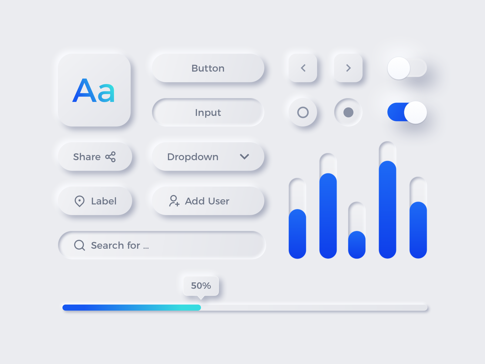
Let's take neumorphism for example. It looks really cool, but it could become an accessibility nightmare if the intensity, blur, and size of the shadows don't create enough contrast for users to identify the component edges.
WCAG 2.1 specifies that the indicator of an input must meet a 3:1 contrast ratio (which is interesting because the default value in most browsers doesn't follow that spec).
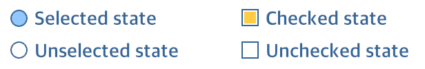
There are more instances of insufficient contrast that needs to be addressed. For example, custom radio buttons and checkboxes should have enough contrast between the selected and unselected state. Even when the contrast ratio with the border may be fine, if a user with visual disabilities have trouble differentiating the background color and the selected color, then we are in trouble:
This applies to more than just the classic form components, there are many others like toggle buttons, rating systems, alert messages, toasts, loaders... Every component needs to have enough contrast to be able to differentiate it and know their status.
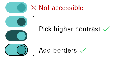
To do this, use the color contrast checkers from the previous article, or try different techniques:
- Ensure enough contrast
- Add borders to differentiate borders
- Use icons to emphasize the differences
As described above, a great deal of the form components accessibility depends on the colors, borders, backgrounds... and all of that translates directly into CSS.
Inline SVGs and currentColor
A common mistake that can be found in many sites is the use of icons that don't have enough contrast... or more specifically, they have enough contrast only in some states of the element that contains them.
Using inline SVGs as icons can take care of that problem because they can be styled with CSS by setting SVG-specific properties (like stroke or fill). And the currentColor keyword can be handy to manage all the states of an interactive element without getting into messy code.
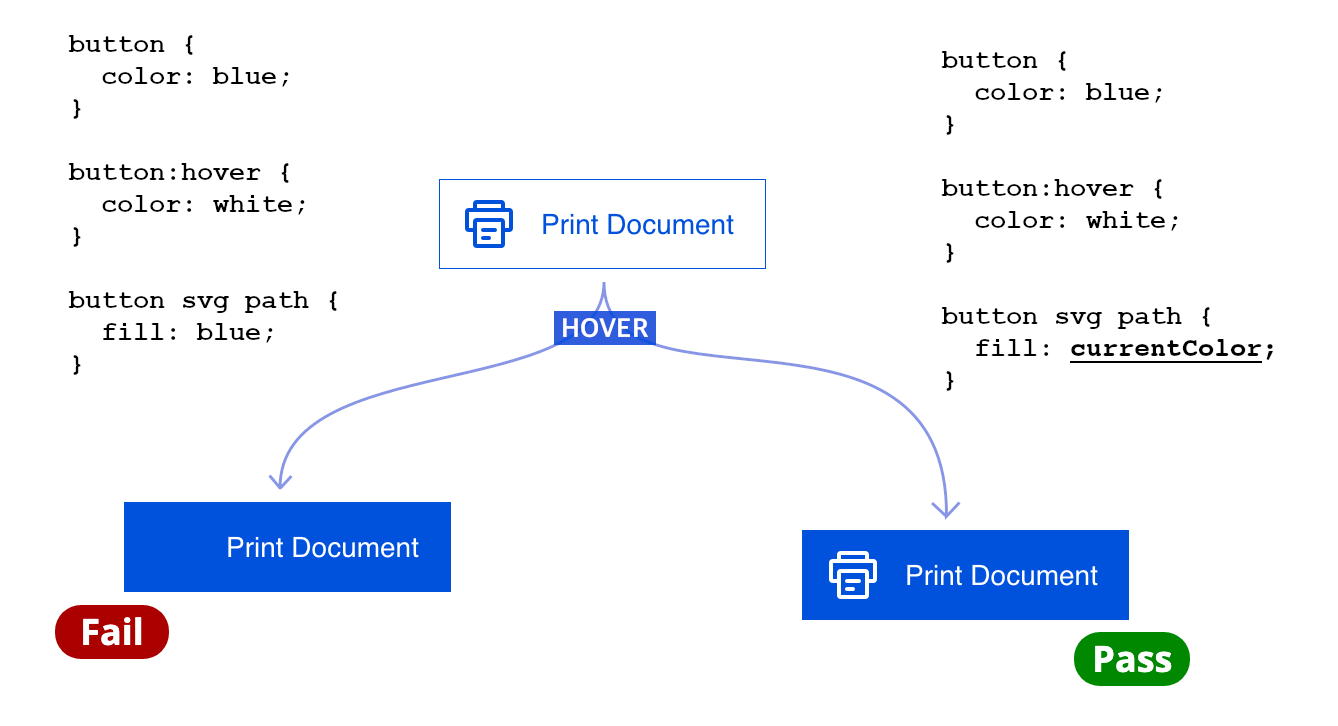
currentColor improving user experience and code maintainabilitycurrentColor represents the value of the current color property (or its inherited value if it's not set), and will ensure that the inline SVG icons have the same color as the text. If we make the text have enough contrast, then the icon will have enough contrast automatically.
Graphs and Charts
Although charts and graphs have been the domain of JavaScript for a long time, it is possible to display information in a chart form just using CSS (e.g. with conic-gradient).
It is not the best option at the moment, but we don't know where CSS can take us. If you do a graph/chart in CSS, make sure that the colors have enough contrast with the background and with the colors surrounding them, so they can be easily distinguishable.
More about this on the next post...
Color contrast is not exclusively for text: icons, form controls, images, and other web elements, must have enough contrast to be visible for everyone.