
Low color contrast text is the top accessibility problem according to the WebAIM Million report, an accessibility analysis of the top 1,000,000 home pages on the Internet.
So, what is color contrast? why is it important for accessibility? and how can we improve it? and what is CSS's role in it?
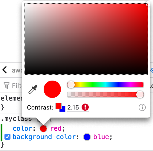
To make it simple, the contrast between two colors can be defined as the difference between both of them. The contrast is a calculated number that goes from 1 to 21 (normally represented as a ratio like 1:1 or 21:1).
If the two colors that we are comparing are the same, the contrast will be 1 (1:1); if they are exact opposites (complementary colors), the contrast will be high; and if they are black and white, they'll have the highest contrast possible (21:1).

As displayed in the image above, high color contrast values are good because they make the text easier to read, while lower color contrast values are bad because the text is more difficult to read (to the extreme of the last example, which is impossible to read for any sighted user.)
At the moment, CSS by itself is insufficient to calculate and prevent contrast issues. For that, we need a more imperative language or using one of the many tools available online (including browsers!). For example:
- WebAIM color contrast checker
- Accessible Web Colors
- Who Can Use (thanks Thomas Leenders for the suggestion)
Actually, creating a color contrast checker is a relatively small and easy project to develop, and it can be helpful to practice new technologies as well as learning about accessibility. A win-win.
Color contrast requirements do not only depend on the colors but also on the size of the text. That makes sense as smaller text is more difficult to read and needs more contrast than larger text.
| Component | AA-level | AAA-level |
|---|---|---|
| Small text (<18pt or >=14pt bold) |
4.5:1 | 7:1 |
| Large text (>=18pt) |
3:1 | 4.5:1 |
Once we have verified that the colors have enough color contrast, we can go back to CSS. As the technology in charge of display and presentation, it is CSS's job to set the background and foreground colors and where the contrast solution will live.
When you work with CSS, remember there are some properties that will affect the contrast of the text:
-
color: the color of the text in itself -
background-colorandbackground-image: notice that the background may be set at an ancestor and not directly at the element. -
font-size: the size of the text.
/* This is accessible */
p {
  color: red;
  background: white;
  font-size: 20px;
}

/* This is not */
p {
  color: red;
  background: white;
  font-size: 12px;
}
What if there's more than one background color?
There are some cases in which you may not know the background color or it may be inconsistent (e.g. using gradients or images as the background).
In those cases, there is not always a clear-cut solution because the same color that may work in a part of the text, may not be sufficient in other parts of the text.
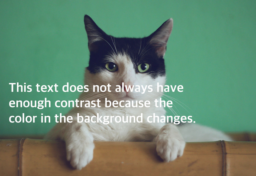
(Cat tax picture from Unsplash)
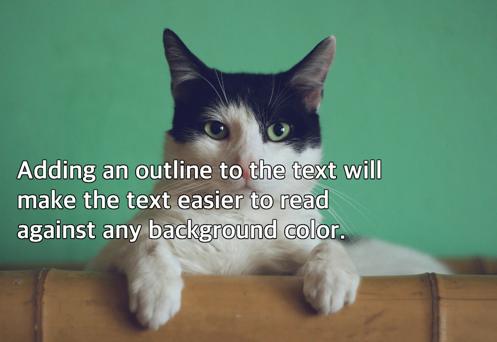
We can add an outline to the text, which will create a border and make the text color "independent" of the background. We just need to ensure that the border color and the text color have enough contrast.
To achieve this we have different options:
-
Using
-webkit-text-stroke-color: this is a simple to develop way but is not a standard property, and it may not look good with smaller fonts. - Using text shadows: which may get more readable results, but it is more difficult to code (especially for thick outlines) and it looks funky with serif fonts.
.text-with-outline-1 {
  color: #fff;
  -webkit-text-stroke-width: 1px;
  -webkit-text-stroke-color: #000;
}

.text-with-outline-2 {
  color: #fff;
  text-shadow:  0px -1px #000,
                1px -1px #000,
                1px  0px #000,
                1px  1px #000,
                0px  1px #000,
               -1px  1px #000,
               -1px  0px #000,
               -1px -1px #000;
}
Make sure that the color of the text has enough contrast over the background, so it is visible and readable.