
We will talk more about the font readability and contrast in the next few posts... but before that, let's see something in the same line as the previous publications: how developers can make CSS work better for the end-users' needs.
Introduction to CSS units
In CSS there are many different units to define the size of an element or the text, but they can be classified in two major types:
- Absolute length units.
- Relative length units.
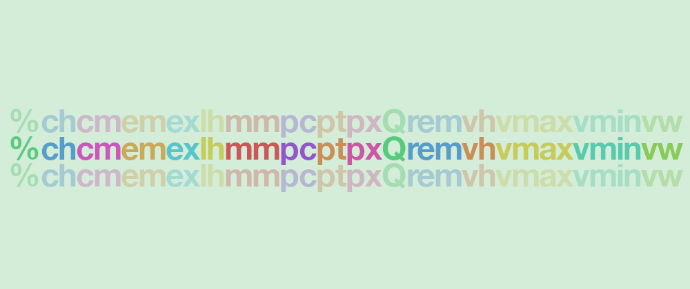
Absolute units are those that are always the same size (in, cm, mm, pc, pt, px, and Q), while relative units depend on another value –they are relative to it–, so the sizes may vary.
Within the relative units, there are some that are relative to the viewport (vh, vmax, vmin, and vw) and some that are relative to the font of some other element in the document (%, ch, em, ex, lh, and rem.)
Which units to use?
For accessibility purposes, it is better to avoid absolute units for text. While it may not be as critical as before –modern browsers do a better job now at scaling text on zoom in/out–, it may not provide with the best user experience (e.g. sentences may be cut, the overflow may not be perfect, scrolls may show up.)
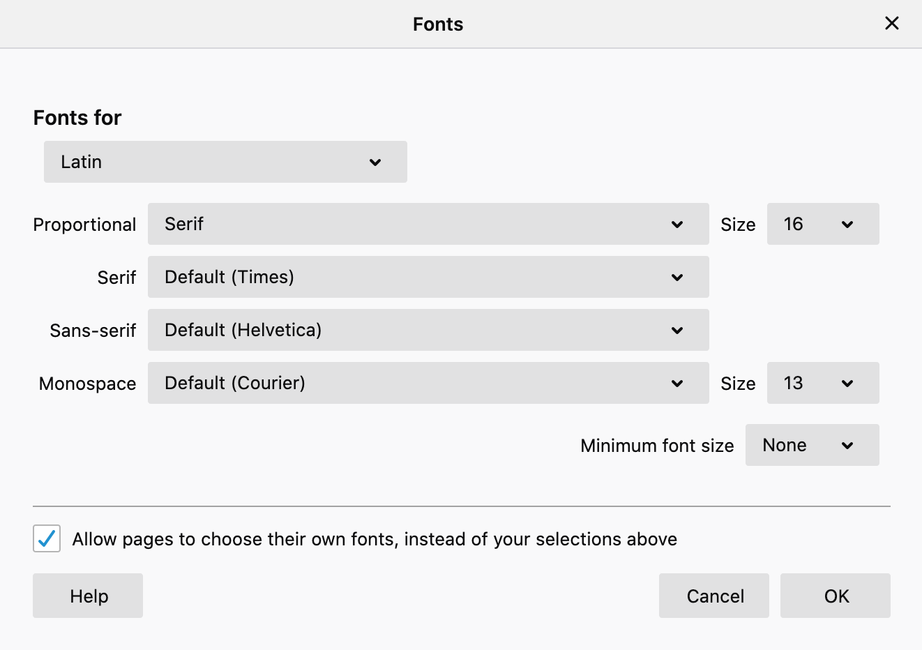
Another reason is that browsers allow users to set default font configurations that are applied at the root level.
Taking that into account, if you use relative units like rem for text, that text will update with the user's choice and adjust to their preferences.
Most browsers have 16px as the font size by default which facilitates the developer's work. Here is an example that shows text before and after updating the default font size on the browser:
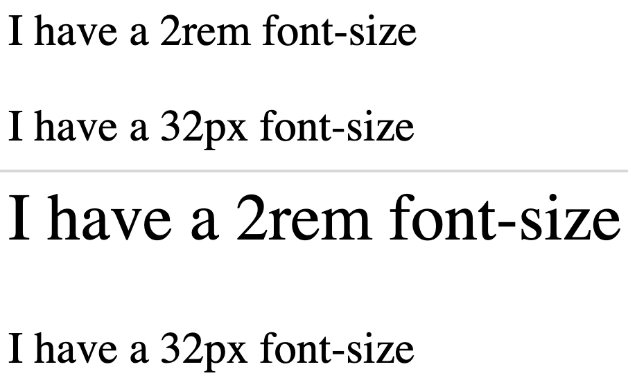
That example also showcases the risks of using abosule units and combining them with relative units: the relative-sized text grows as requested, while the absolute-sized text remains the same size at all times. It doesn't adapt to the user's configuration and it is not really responsive.
Are all relative units ok?
One important thing to note is that not all relative units will work fine with text.
rem and em are relative to the font-size of the root and parent respectively and work fine for accessibility, but units like vmin or vmax that are relative to the viewport may not be as accessible.
Note:
emis a tricky one, as it is relative to the parent, it will be as responsive as the parent's font unit is.
Viewport units are interesting for creating immutable designs that behave the same independently of the screen size and resolution... but that is also a risk: in smaller devices the font may end up being too small to be read.
And that would be the recommendation: use a font-relative size for font sizes (and in partiular rem) as it will adapt better to the user's browser configuration.
Note: You may want to use the same unit that you use for the text also for the paddings and margins, that way the proportions will remain the same if the user's settings change.
Use font-relative units to define text font sizes.