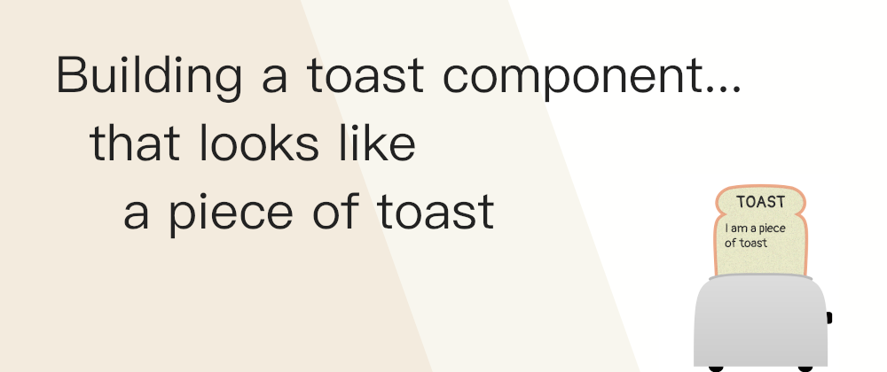
Just for fun, I started building some components with HTML, CSS, and JavaScript (without libraries or frameworks)... but, instead of going for a formal library, I based their appearance on their names (even when they won't look anything like each other).
The first one I've done is a Toast component... that looks like a piece of toast coming out of a toaster:
The structure
The HTML skeleton of the component is fairly simple and can be summarized in three parts:
- A parent container: used to slide the component on and off of the screen
- The toaster container: just with an image
- The toast container: including the toast image and the text
Images
For the images, I opted for using SVG because it would allow us to scale them and make the component responsive without having to make any changes.
Both images are inline. This is not necessary in the case of the toast, but for the toaster, it allowed me to add interactivity to some of the parts (e.g. the toaster button) which would come handy later.
One silly thing that I'm proud of, is that I drew both the toaster and the toast without using any drawing software, just by calculating approximate values from the top of my head and entering the points manually. That's why they are not too fancy :P
SVG also allows for some filters. Initially, the bread was flat, but using the filter <feTurbulence> I was able to add some texture:

Animations
I overcomplicated a little the CSS animations for this component because I wanted to have different behavior coming in and out of the screen.
So I ended up with 7 different animations applied at different moments and different speeds:
- Slide the whole content in
- Slide the whole content out
- Pop the bread out (with a small bounce)
- Pull the bread in (without the bounce)
- Pop the toaster button up
- Move the toaster button down
- Make the toaster button change color intermittently.
Initially, the slide-in had a small bounce, but now the slide-in and the slide-out are the same in the opposite direction. That could be used to simplify a little the code (I could run the same animation in reverse), but I left it as-is while I tested other options. And the same applies to the toaster button pop up/down animation.
Accessibility
Some of the accessibility features included in the component:
- The root element has a role of "status" so it is announced when the text changes as it enters the screen.
- There is a
prefers-reduced-motionmedia query to remove the animations and set everything in place without movement (just pops in and out). - It is responsive: the size and text of the component change depending on the screen size (within certain limits)
- The SVGs include a title and description (although not important as they are only decorative... just in case I reuse)
Logic and JavaScript
There is nothing fancy in the JavaScript I used to create the component. It is plain old vanilla JavaScript (which could almost be considered fancy).
The logic and code of the component are encapsulated in a function that returns an object with the different values and methods that can be called.
As a possible improvement –maybe for the next component?– I could move the HTML to a template and/or generate it with JavaScript. That way if the component is multiple times on the page, it won't require the copy-pasting of code.
Lessons learned
Summarizing, this was a nice practice. I will continue goofing with this and creating more silly-looking components for fun.
It also allowed me to learn and try interesting things like:
- Playing with different SVG filters for adding some texture to the bread and burnt-level (more info on filters on MDN and Smashing Magazine).
- Read about accessibility related to the Toast component (like this one from Scott O'Hara or this post from Adrian Roselli).
- Practicing with some assistive (ChromeVox and VoiceOver).

