While most elements on a web page can be styled using CSS, there are some widgets and native elements that cannot be styled directly and have their appearance based on the browser or operating system (e.g. radio buttons, checkboxes, date pickers, etc.)
appearance is an exciting CSS property that could help with this. It was introduced in 2015 and it is considered experimental, but its basic functionality has been supported for years in all modern browsers –even on Edge!
With appearance, developers get some control over how some native elements are styled. They can make the components look like other native elements, or directly strip them of their styles and define new ones.
The values of appearance can be:
-
none: the element loses its native appearance and will be rendered following the rules of CSS. -
auto: widgets and native elements will keep their native appearance. -
button: the element will be rendered with the look-and-feel of a<button>. -
textfield: only works on an input of type "search", which will be rendered as an input of type "text" (see below) -
menulist-button: only works on a<select>, which will be rendered as a dropdown box (see below).

textfield and menulist-button respectively, on ChromeSome other values exist for backward compatibility with earlier non-standard versions of the property (searchfield, checkbox, radio, etc.) They will behave like having set a value of auto.
Note that browsers may ignore some CSS properties to ensure that the appearance and usability of the element/widget are preserved and not impacted.
A use case: radio buttons
An example of a use case would be the radio buttons. Those elements are rendered differently from browser to browser and from system to system.
To go around this, UI libraries and frameworks came up with various alternatives to display radio buttons consistently across all browsers. Most of them consist of hiding the element (in an accessible way), and then use images, additional HTML elements, and/or pseudo-elements, to draw the checked and unchecked states of the radio.
That is a good solution that solves the problem. But in some cases, it adds unnecessary complexity to an HTML code, that could/should be as simple as this:
<label>
  <input type="radio" name="my-radio" value="1">
  <span>Label of the radio button</span>
</label>
Using appearance with value of none, we could make our radio buttons look however we want while keeping the same HTML structure. Just adding a handful of lines of CSS. For example:
One issue with this appearance approach is that not all browsers will support it. All modern browsers will, but old browsers (IE) will ignore and still display the native way:


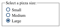
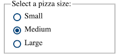
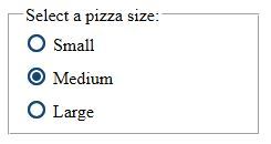
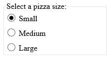
appearance-modified radio button on Chrome, Firefox, Edge, and IE respectivelyTaking into account that the browsers that don't support it fall back to the native behavior, it's not as bad as it could be. But still not ideal because the element wouldn't be consistent as if we had followed a different approach.
Accessibility-wise, screen readers detect the radio button correctly. Even when the appearance is none, it is detected as a radio button, and the label is read. Following the normal native behavior.
Ok... Where's the catch?
Playing with the native visualization of the elements may seem like a cool idea to standardize behavior, but it can be tricky and "dangerous."
We already talked about the browser support, but there are other ways in which this could go wrong from a usability and accessibility point of view. For example: changing a form control to look like a completely different form control could be misleading and confusing to the user.
Also, the browser takes care of the different states of the element "out of the box" while, if we change the appearance, it will be on us to make sure that we are providing everything needed.
It could be easy to miss "small" details like how it would be printed or how it would render in high contrast mode. Like in the first example above, that may not be printed correctly.
