
One way to make a website more appealing to the end-user is by adding extra interactivity and responsiveness to their actions. It is eye-candy and it gets the users more engaged.
In that sense, it is fascinating the work that Darin Senneff and many others do creating interactive forms and complex components/templates –my favorite by far is Senneff's log-in form.
But those animations and interactive features are not exclusive for complex components. You could add micro-interaction almost anywhere –in moderation or it could be overwhelming–, and form controls are great for that.
Also, you don't need to use big frameworks or libraries to achieve this. Libraries will make your life easier and the animations smoother –GSAP does miracles for animating SVGs–, but many browsers already animate SVGs without needing additional code.
That's why in this post, we are going to see how we can use plain HTML, CSS, and JavaScript to create interactive input fields that will adapt to the values that the user is entering.
No complex components. No big frameworks. No external libraries. Just leveraging standard HTML, CSS, and vanilla JavaScript. The effects may not be as fancy, but there won't be any learning curve.
Now, let's start...
What are we going to build?
We are going to create a time picker that uses the default HTML5 time input and, to identify the field, it has been extended with an interactive icon (change the time and see the icon respond to the new values):
As mentioned above, we are not going to use any library or framework, so all that you will need for development is a text editor to write the code, and a browser to see the results.
Let's begin with the fun part.
The code
This may sound weird, but the whole functionality takes only 15 combined lines of HTML, CSS, and JavaScript. Yes, you may need a little bit more to style the input the way you want, but the basic functionality is 1 line of HTML, 7 of CSS, and 8 of pure vanilla JavaScript. Seriously.
The HTML
Not so long ago, the HTML input tag types were really limited: we had a text input, password text, radio buttons, checkboxes, and regular buttons. But as part of HTML5, many input types were added:
<input type="email" />             <!-- Email -->
<input type="url" />               <!-- URL -->
<input type="search" />            <!-- Search string -->
<input type="number" />            <!-- Number -->
<input type="date" />              <!-- Date -->
<input type="week" />              <!-- Week -->
<input type="month" />             <!-- Month -->
<input type="datetime" />          <!-- Datetime (obsolete, use the one below) -->
<input type="datetime-local" />    <!-- Datetime -->
<input type="tel" />               <!-- Telephone -->
And browsers caught on too: if the developer specified that the input was of type date, why just show it as a boring text input? They could display a formatted input with a calendar pop-up for the user to pick. For example, this is the one from Chrome:

And using them has some advantages: these inputs are correctly-formatted and accessible out of the box. No need to worry about the user typing the date correctly, the browser will impose it for you, and it will be natural and transparent to the user.
One of the inconveniences is that some older browsers do not support these new text inputs. But that's not a big problem as if an input type is not recognized, it is simply displayed as the regular text input.
Another inconvenience is that the pop-ups/display formats cannot be styled. At least, not in a common way to all the browsers. But we are not going to worry about that in this post.
Going back to the code. Our input is going to be of type "time", so all the HTML code that is required is this:
<input type="time" />
Just by doing that, the browsers that support the type will display something like this:

That's it. Let's move on to the next step.
The CSS
Before we dive into the CSS, let's see a little bit of SVG. The SVG (acronym of Scalable Vector Graphics) format allows us to create vectorial images using XML notation similar to the one from HTML.
With SVG we can draw circles, rectangles, lines (straight or curved using paths), and it will adapt to different sizes without losing quality. For this example, I created a small image of a clock with two simple handles:
<svg xmlns='http://www.w3.org/2000/svg' width='40px' height='40px' viewBox="0 0 40 40">
  <circle cx='20' cy='20' r='18.5' fill='none' stroke='#222' stroke-width='3' />
  <path d='M20,4 20,8 M4,20 8,20 M36,20 32,20 M20,36 20,32' stroke='#bbb' stroke-width='1' />
  <g fill='#222' stroke='#222' stroke-width='2'>
    <circle cx='20' cy='20' r='2' />
    <path d='M20,24 20,5' style='transform:rotate(120deg); transform-origin: 50% 50%;' />
    <path d='M20,24 20,8' style='transform:rotate(20deg); transform-origin: 50% 50%;' />
  </g>
</svg>
Which will generate a clock like this one:

Also, one advantage of SVG is that it can be used inline in the CSS. So we can set up as the background image of an element by doing:
background-image: url("data:image/svg+xml;utf8,<svg>...</svg>");
Now that we have our image and we know how to use it in CSS, we need to think of what else we will need:
- Set the image in the background (as described above with
background-image). - Place the image on the left side of the input (with
background-position). - Indicate that the image should not repeat (using
background-repeat). - Make it as large as the text (with
background-size). - Leave some space for the image by pushing the text within the input (using
padding-left).
We know how to do all of the above in CSS. And it's not that complicated! The code for that would look like this:
input[type="time"] {
  padding-left: 1.5em;
  background-repeat: no-repeat;
  background-position: 0.25em center;
  background-size: 1em;
  background-image: url("data:image/svg+xml;utf8,<svg xmlns='http://www.w3.org/2000/svg' width='40' height='40'><circle cx='20' cy='20' r='18.5' fill='none' stroke='%23222' stroke-width='3' /><path d='M20,4 20,8 M4,20 8,20 M36,20 32,20 M20,36 20,32' stroke='%23bbb' stroke-width='1' /><g fill='%23222' stroke='%23222' stroke-width='2'><circle cx='20' cy='20' r='2' /><path d='M20,24 20,5' style='transform:rotate(120deg); transform-origin: 50% 50%;' /><path d='M20,24 20,8' style='transform:rotate(20deg); transform-origin: 50% 50%;' /></g></svg>");
}
Notice how we use
emas the unit. This will help the icon adjust automatically its position and size, independently of the unit used for the font size of the text in the input.
With those 7 lines of code, the time input looks like this now:

For some strange reason, Chrome adds a different type of border when we added a background-image. But we don't worry about it much, because we can stylize the border later to make it look better.
Let's finish our clock by adding the interaction in JavaScript.
The JavaScript
For the interactivity, we are going to use vanilla JavaScript. What we want to do is, every time that the
// every time that the time picker changes value
document.querySelector("input[type='time']").addEventListener("input", function() {
  // regular expression that verifies the format HH:MM
  const reTime = /^([0-1][0-9]|2[0-3]):[0-5][0-9]$/;
  // if the value matches the regular expression
  if (reTime.exec(this.value)) {
    // read the values of minutes and hours and update them
    const minute = Number(this.value.substring(3,5));
    const hour = Number(this.value.substring(0,2)) % 12 + (minute / 60);
    // set the same background image but with different hour/minute angles
    this.style.backgroundImage = `url("data:image/svg+xml;utf8,<svg xmlns='http://www.w3.org/2000/svg' width='40' height='40'><circle cx='20' cy='20' r='18.5' fill='none' stroke='%23222' stroke-width='3' /><path d='M20,4 20,8 M4,20 8,20 M36,20 32,20 M20,36 20,32' stroke='%23bbb' stroke-width='1' /><g fill='%23222' stroke='%23222' stroke-width='2'><circle cx='20' cy='20' r='2' /><path d='M20,24 20,5' style='transform:rotate(${360 * minute / 60}deg); transform-origin: 50% 50%;' /><path d='M20,24 20,8' style='transform:rotate(${360 * hour / 12}deg); transform-origin: 50% 50%;' /></g></svg>")`;
  }
});
I made the hour value a bit more realistic by adjusting it not only to the hour but also to the minutes that have passed within that hour.
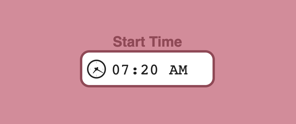
Those 8 lines of JavaScript (without comments) will make the clock handles update to represent the time selected in the input. Giving us the final result (plus slight updates to make it look better):
One flickering issue
I tested this in different browsers on Mac and Windows, the results were:
- On Chromium-based browsers (Chrome, Opera, Brave, new Edge, etc.) and Firefox, both the input
type="time"and the animation work fine. - On Safari the input
type="time"does not work, but the animation does if the user enters a valid time (formatHH:MM). - On Edge on Windows, the input
type="time"does work, but the animation does not (the whole clock is not displayed).
On Firefox, there is an issue though. When the handles' angle is updated with JavaScript, the whole clock icon flickers/blinks. This is caused by how Firefox handles the rerendering of the background.
One possibility to minimize the impact of this flickering is to break the SVG into smaller parts: one with the clock frame, and two for each of the handles. CSS allows stacking multiple background images separated by commas:
background-image: url(image1), url(image2), ...url(imageN);
That way, when we update the time, the only thing that will flicker will be the handles, and they were moving anyway, so the flickering is gone (or partially gone).
Conclusion
With the extended support for HTML5 and its input types, we can create interactive elements that don't require heavy libraries or complicated coding.
While the support may not be fully there, moving forward we should count on getting more and more support as the failing browsers will eventually disappear (IE), adapt (Edge switching to Chromium), or add the support (Safari... hopefully).
There will still be a long way to go, as giving styles to the pop-ups (for the calendar, week, month, etc.) still differ considerably from browser to browser. But everything will come.
Also, this interactivity doesn't have to be limited to the time type. You can apply similar effects to any of the input types, and create your own. The only limit should be your imagination. Other examples:
I hope you enjoyed the post, it is again longer than I expected. If you made it here... thank you for reading it!