We already have the HTML skeleton from the previous post, and it's a functional form. It is time now to style it so it looks nice.
Considerations
Browser support
The first consideration is going to be what browsers we want to support. It may sound silly: Chrome, Firefox, Safari, and Edge are in... but should we include IE11 in the mix?
Controversial opinion here: IE11 should be included and supported. According to the WebAIM's Screen Readers User Survey, it is still more utilized than Edge and Safari by screen reader users... but, aiming for simplicity in this demo, we will not add support for IE11. You can extend it by using polyfills and fallback values.
Theming: CSS Variables and colors
We want to make the form themable, so we can quickly change some parameters and have a different looking form with little to no effort. And for that, we will make use of CSS variables (<-- one of the features not supported by IE11).
As for the colors, and as we mentioned in the original post, we opted for the HSL format. In HSL, you define the Hue, Saturation, and Light of the color, which is really convenient for creating shades... and incredibly powerful when combined with CSS variables and functions.
The hsl()/hsla() function allows CSS variables and other functions (especially calc()) as parameters. So we can define a default color, and different shades for the different states.
In the form rule we added new variables to handle the colors:
form {
  /* almost white background color */
  --bgColorH: 0;
  --bgColorS: 0%;
  --bgColorL: 98%;
  /* dark blue foreground color */
  --fgColorH: 210;
  --fgColorS: 50%;
  --fgColorL: 38%;
}
Page and general styling
But before that, let's start with some general style: let's make the page gray and have the login form on the absolute center -vertical and horizontal- of the screen. There are different ways to achieve this, but We are going to go with FlexBox.
html, body {
  align-items: center;
  background: #f2f4f8;
  border: 0;
  display: flex;
  font-family: Helvetica, Arial, sans-serif;
  font-size: 16px;
  height: 100%;
  justify-content: center;
  margin: 0;
  padding: 0;
}
Fun fact: centering content in a page is, or it used to be, one of the most popular CSS question in StackOverflow. If you are centering using Flexbox, you will need
justify-content: centerandalign-items: centerto align horizontally and vertically, respectively. But if you don't specify the height of the container, its content will look only horizontally centered.
Adding these styles to the HTML, our form will look like this:
We can continue by giving the form the look of a card: white background, a box-shadow, some rounded corners...
form {
  --background: rgba(255, 255, 255, 1);
  --border: rgba(0, 0, 0, 0.125);
  --borderRadius: 0.125rem;
  background: var(--background);
  border: 1px solid var(--border);
  border-radius: var(--borderRadius);
  box-shadow: 0 1rem 1rem -0.75rem var(--border);
  overflow: hidden;
  padding: 1rem;
  position: relative;
}
As you can see, we already started using variables. Many more will be later added to the form because they cascade and can be used in its children. This may not be the best thing to do (limiting scopes is a good idea), but it's what we'll opt for in this demo.
Also, you may have noticed that we have removed the display: flex from the original demo. As the elements are in their "right order", there's no need to reorder them with FlexBox.
The result already looks cleaner:
Now let's go for the inputs. They will make a huge difference.
Styling the input fields
The inputs will take 100% of the width of the form, they will have a rounded border, and they will also have a small label text.
There are tons of ways to style inputs and labels. We tried to keep it simple (but hopefully elegant, I am not a designer, so it may be the worst thing ever). You could go with anything you want: animations, different fonts, icons in the inputs... the options are limitless.
input {
  border: 1px solid var(--border);
  border-radius: var(--borderRadius);
  box-sizing: border-box;
  font-size: 1rem;
  height: 2.25rem;
  line-height: 1.25rem;
  margin-top: 0.25rem;
  order: 2;
  padding: 0.25rem 0.5rem;
  width: 15rem;
  transition: all 0.25s;
}

label span {
  display: block;
  font-size: 0.825rem;
  margin-top: 1rem;
  position: relative;
}

input[type="submit"] {
  color: hsl(var(--bgColorH), var(--bgColorS), var(--bgColorL));
  background: hsl(var(--fgColorH), var(--fgColorS), var(--fgColorL));
  font-size: 0.75rem;
  font-weight: bold;
  margin-top: 0.625rem;
  order: 4;
  outline: 1px dashed transparent;
  outline-offset: 2px;
  padding-left: 0;
  text-transform: uppercase;
}
It may look like we are overcomplicating the colors at the moment by breaking them in HSL instead of using HEX. But the HSL format will come handy later when we need to add different shades.
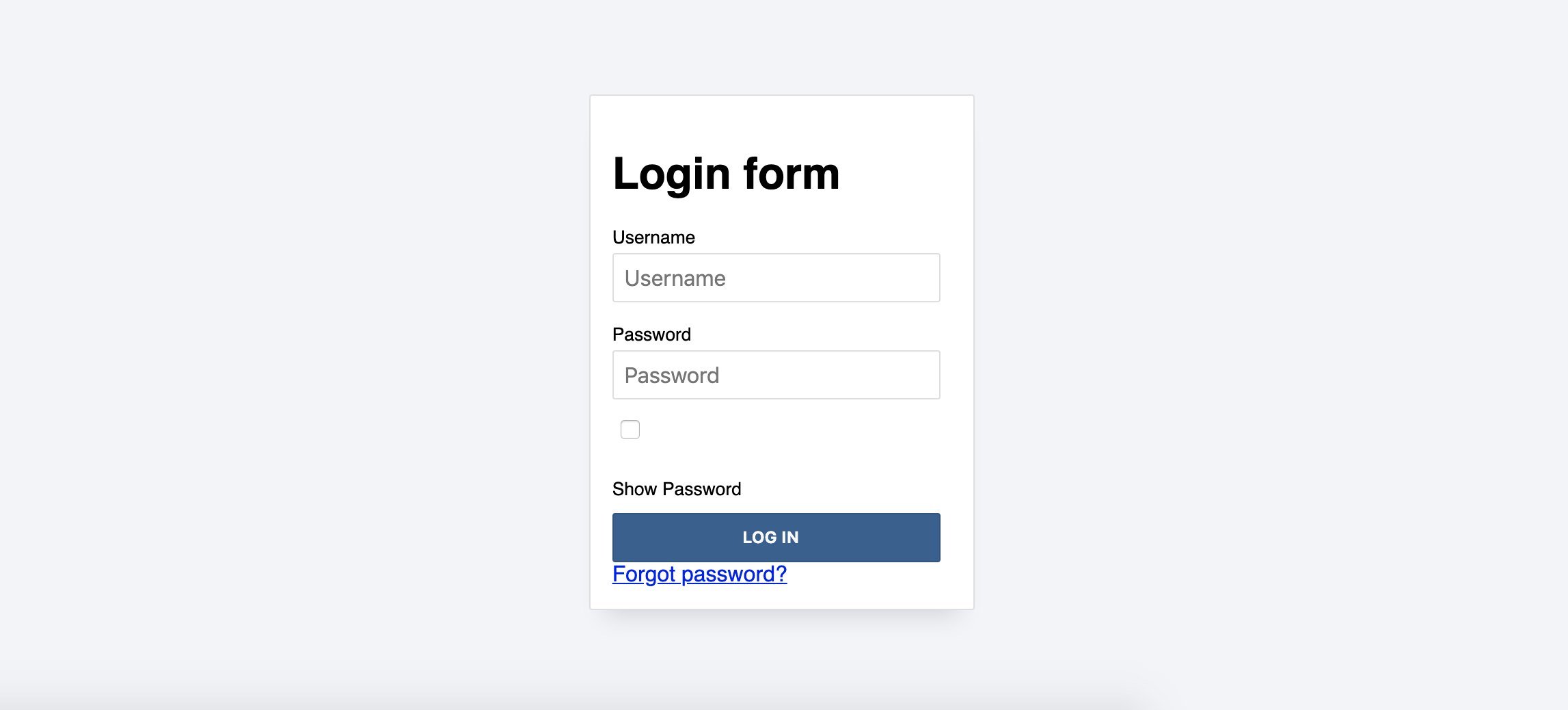
The code above leaves us with this:
Looking promising, but he "Show password" checkbox looks off... let's style it differently.
Show password
As for the "Show password" checkbox... it will be hidden, and we will simulate a checkbox using styling and based on the state of the actual box. One big advantage of this: the checkbox will look the same in all browsers.
To hide the checkbox we are going to go with an accessible approach: hiding the elements visually, but not from screen readers. That way, the checkbox will still be focusable and accessible via keyboard, and we can take advantage of the CSS state pseudo-classes.
As the form is positioned relatively and its overflow is hidden, we need to push the element outside as far as possible:
.a11y-hidden {
  position: absolute;
  top: -1000em;
  left: -1000em;
}
We created a new class because we will use later for other elements (e.g. the form title).
Now that we added the class to the checkbox and it is hidden, let's create the visual checkbox using the ::before and ::after pseudo-elements. With ::before we will create a box, and with ::after we will fill it in if the checkbox is actually checked (with the :checked pseudo-selector):
input[type="checkbox"] + span {
  margin-top: 0.25rem;
  padding-left: 1.25rem;
  position: relative;
}

input[type="checkbox"] + span::before {
  content: "";
  display: block;
  position: absolute;
  top: 0;
  left: 0;
  width: 0.75rem;
  height: 0.75rem;
  border: 1px solid var(--borderDark);
  border-radius: var(--borderRadius);
  transition: all 0.25s;
  outline:1px dashed transparent;
  outline-offset: 2px;
}

input[type="checkbox"]:checked + span::after {
  content: "";
  display: block;
  position: absolute;
  top: 0.1875rem;
  left: 0.1875rem;
  width: 0.375rem;
  height: 0.375rem;
  border: 1px solid var(--borderDark);
  border-radius: var(--borderRadius);
  transition: all 0.25s;
  outline:1px dashed transparent;
  outline-offset: 2px;
  background: hsl(var(--fgColorH), var(--fgColorS), var(--fgColorL));
}
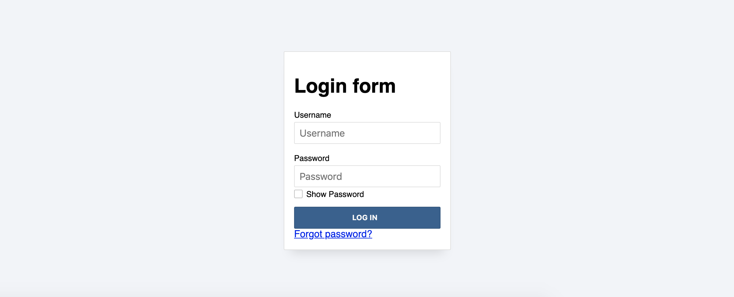
...and the form ends up like this:
Text styling
The last thing before finishing our first version of the styling is changing the style of the text. That includes title, labels, and "forgot password?" link:
- For the form title, we are going to hide it visually in the same way we hid the checkbox: by adding the
a11y-hiddenclass. - We want the labels to be lighter so they don't get much attention (later we will add interactivity and additional styling to highlight them in some cases).
- As for the link, we'll make it smaller and match the main color.
.forgot-password {
  margin-top: 0.125rem;
  text-align: center;
}

.forgot-password a {
  color: hsl(var(--fgColorH), var(--fgColorS), var(--fgColorL));
  font-size: 0.825rem;
  order: 4;
  text-align: center;
  margin-top: 0.25rem;
  outline: 1px dashed transparent;
  outline-offset: 2px;
  display: inline;
}

.forgot-password a:hover {
  color: hsl(var(--fgColorH), var(--fgColorS), calc(var(--fgColorL) * 0.85));
  transition: color 0.25s;
}
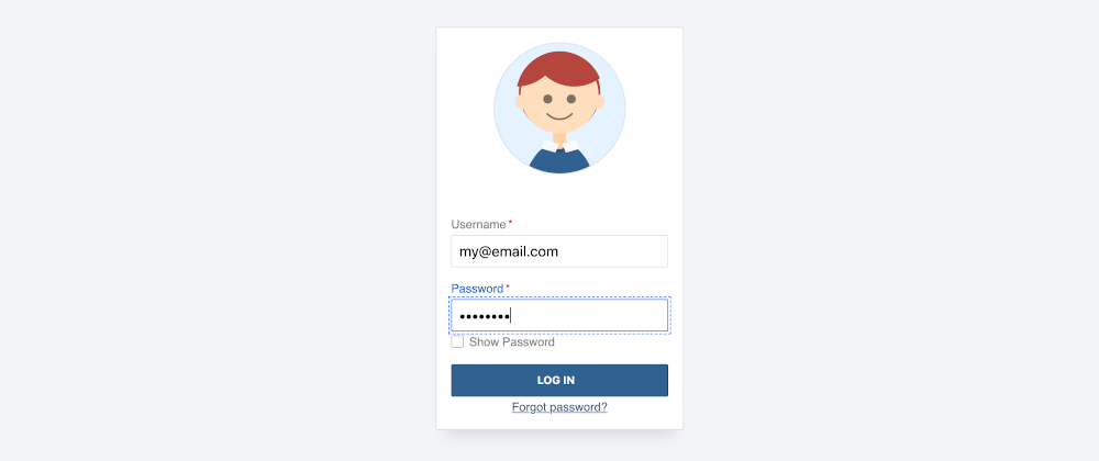
The final result looks like this on JSFiddle:
The form looks fancy now. There is some extra spacing on top because of the empty figure, but that's something we'll fix in the next step.
Let's make it fancier!


