In the original post, we explained how the natural order of the form would be:
- Image of the person
- Username/Email text field (label + input)
- Password text field (label + input)
- Show Password checkbox (input + label)
- Submit button
- Forgot password link
But due to the challenge restrictions -and the no JS rule in particular-, we were forced to reorganize the elements. In this version, we will handle the interactivity using JavaScript so we can go to that original plan.
After the rearrangements, the HTML looks like this:
<form method="post" action="javascript: void(0);" id="login-form" class="login-form" autocomplete="off">
  <h1>Login form</h1>
  <figure>
    <!-- Placeholder for the image -->
  </figure>
  <div>
    <label class="required">
      <span>Username</span>
      <input type="text" name="username" id="username" placeholder="Username" required />
    </label>
  </div>
  <div>
    <label class="required">
      <span>Password</span>
      <input type="password" name="password" id="password" placeholder="Password" required />
    </label>
  </div>
  <div>
    <label>
      <input type="checkbox" name="show-password" id="show-password" />
      <span class="checkbox-label">Show Password</span>
    </label>
  </div>
  <input type="submit" value="Log In" name="submit" id="submit" />
  <div class="forgot-password">
    <a href="#">Forgot password?</a>
  </div>
</form>
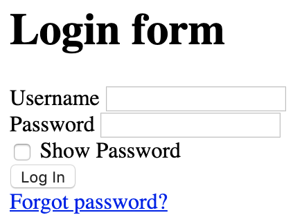
This will generate a form that looks like this:

It doesn't have styles and it looks really ugly, but it is a great starting point for what we want:
- All inputs (but the submit button) have labels attached to them.
- We have a placeholder for the interactive image.
- If the CSS or JS don't load, the form will still be functional. Even if it's not pretty.
And this functionality is important. We are building the form from the bottom up, following the progressive enhancement methodology: we start from a simple working form and build on top, adding new features and enhancing it.
The code is still close to the original but there are some differences:
-
The fields are organized more naturally. I know I mentioned it, but this will save us from using
tabindexor reordering the code via CSS, which is nice. -
The method was changed from
gettopost. This is a login form, the method should have never beengetto begin with. All the information sent viagetis visible to the users on the address bar, which could be a potential security issue. - The label text was moved from after the field to before the field: I'm writing the posts as a re-develop the form on the side, so when we get to the styles, we may change this again.
And also some things that stay the same:
- HTML5 validation. we delegate the validation on the browser. Although we may add JS validation (which could lead to a 7th step in the process).
- The "Show Password" label text goes before the input. This way it will be easier to style the checkbox.
-
The
formhas anautocomplete="off". This way the form will not suggest user/passwords when you enter it. Although it may be useless as many browsers do not support it anymore.
Here is a JSFiddle of where we are at the moment:
Next step: adding styles.

