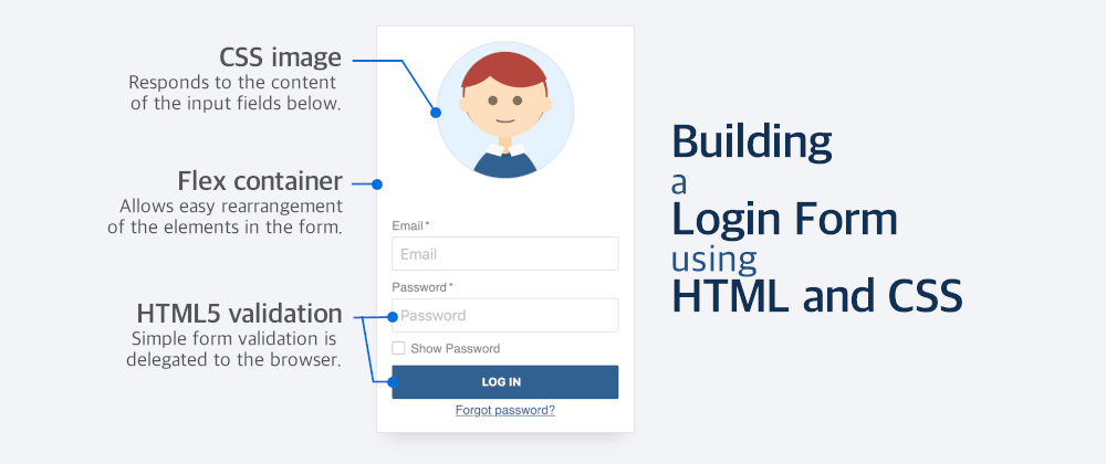
The yeti login form created by Darin Senneff is amazing and, along with most of the things he builds, has been a continuous source of inspiration:
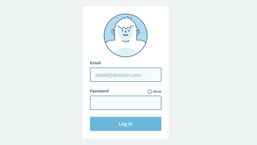
In the past, I created my version of this animated login form using HTML, CSS, SVG, and JavaScript. But the animations were a bit choppy because I used plain CSS to animate the SVG (instead of adding GreenSock) and not all browsers support it.
After a few incredibly busy weeks at work, I finally had some time yesterday to do development for fun. And I decided to try another version of this interactive form using only HTML and CSS, without any SVG or JavaScript at all.
If you want a similar tutorial but with JavaScript, don't miss the series "How to build an interactive form", in which I explain step by step how to build a form like this one using HTML, CSS, and JS.
The limitation of not using JavaScript or SVG was to make it more of a challenge and to see if it was possible at all (spoiler alert: kind of, but with some restrictions), and to learn new things while building it.
The first step was creating a simple form with the elements I wanted in the following order:
- The image of the person (just simple CSS)
- Username/Email text field (label + input)
- Password text field (label + input)
- Show Password checkbox (input + label)
- Submit button
- Forgot password link
I had the main structure of the form without animations or interactivity... Then the fun began.
Organizing the elements
In my previous form, the interactivity was handled via JavaScript. No JavaScript meant I had to use the information from the fields to animate the image... and that meant having to restructure the code a little bit.
The CSS image couldn't go on top anymore as it would need the values of the fields to update its state. It needed to be at the bottom of the code even when it was displayed on top. For this, I could try different approaches with FlexBox or Grid.
I opted for FlexBox -in hindsight, it might have not been the best choice- and reordering the elements using the order property.
So the image went to the bottom and the "Show Password" went to the top of the Password. Some order values were applied, and I had to adjust the tabindex to the elements so they had the same keyboard order as they had on display (something that would raise some accessibility concerns later.)
The final order looked like this:
- Username/Email text field
- Show Password checkbox
- Password text field
- Submit button
- Forgot password link
- The image of the person
Animating the image
Now that all the elements are in place, and that the CSS person has been drawn, I can add some animation to it.
A simple one was making it blink: it doesn't depend on anything else, and considering that the eyes are circles, to mimic a blink we change the height of the eye from its original value to 0, and back to the original value. Something like this (simplified):
@keyframes blink {
  0%, 90%, 100% {
    height: 0.625rem;
  }
  95% {
    height: 0;
  }
}

.eyes {
  animation: blink 5s infinite;
}
That was the easy one. The next thing would be the mouth. The character always has a little smile in its eyes, but to convey that all the fields are correct it has a larger smile.
To achieve this, I use HTML validation (see below) and combine it with the selectors :valid/:invalid.
The mouth is the bottom border of an element. To make it larger, I adjust the width and height (and position) of that element. Code simplified:
.mouth {
  border: 0.125rem solid transparent;
  border-bottom: 0.125rem solid #422;
  border-radius: 50%;
  transition: all 0.5s
}

/* invalid: smile... but not too much */
form:invalid .mouth {
  top: 75%;
  left: 50%;
  width: 25%;
  height: 10%;
}

/* valid: big smile by expanding size */
form:valid .mouth {
  top: 60%;
  left: 50%;
  width: 40%;
  height: 40%;
}
Unfortunately, the :valid/:invalid pseudo-classes do not work nicely with forms in IE and Edge... which limits a bit the scope of the demo.
One additional animation was to make the character close the eyes when the "Show Password" field is checked. I could use something more elaborated (like having hands moving up and down), but I will leave that for a future enhancement.
Hiding the password
Having the text change from regular text to asterisks and back was the trickiest feature of all. I could have sworn that it could be achieved using text-transform, but that was not the case.
There is a non-standard -webkit-text-security property that allows developers to achieve this. But it will only work in WebKit browsers. This was a test, so I gave it a try (code simplified):
/* show the text field as asterisks in normal mode */
input[name="password"] {
  -webkit-text-security: disc;
}

/* if show password is checked, show the actual text */
input[name="show-password"]:checked ~ input[name="password"] {
  -webkit-text-security: none;
}
This will work. But of all the tricks used to develop the form, this is probably the only one that I would definitely replace with JavaScript as it considerably reduces the support of the form.
Color and theming
Being able to change colors in components and sites is a major feature nowadays... why not add it to my demo?
Instead of using fixed values for colors, shades or sizes, I defined CSS variables at a higher level (the form tag) and reused them in the elements contained in it.
For the colors, I opted for the HSL format. In HSL, you define the Hue, Saturation, and Light of the color, which is really convenient for creating shades... and incredibly powerful when combined with CSS variables and functions.
The hsl()/hsla() function allows CSS variables and other functions (especially calc()) as parameters. So we can define a default color, and different shades for the different states.
This is an example in which we have a dark blue color that is used as background in the button, and for the hover state we use a 20% darker shade of the same color:
form {
  /* default color: dark blue in HSL */
  --colorH: 210;
  --colorS: 50%;
  --colorL: 38%;
}

/* the button will be dark blue by default */
form button {
  background: hsl(
                   var(--colorH),
                   var(--colorS),
                   var(--colorL)
                 );
}

form button:hover {
  /* 20% darker using calc */
  background: hsl(
                   var(--colorH),
                   var(--colorS),
                   calc(var(--colorL) * 0.8)
                 );
}
Here is a screen capture in which you can see how changing the Hue value changes the palette used in the form:
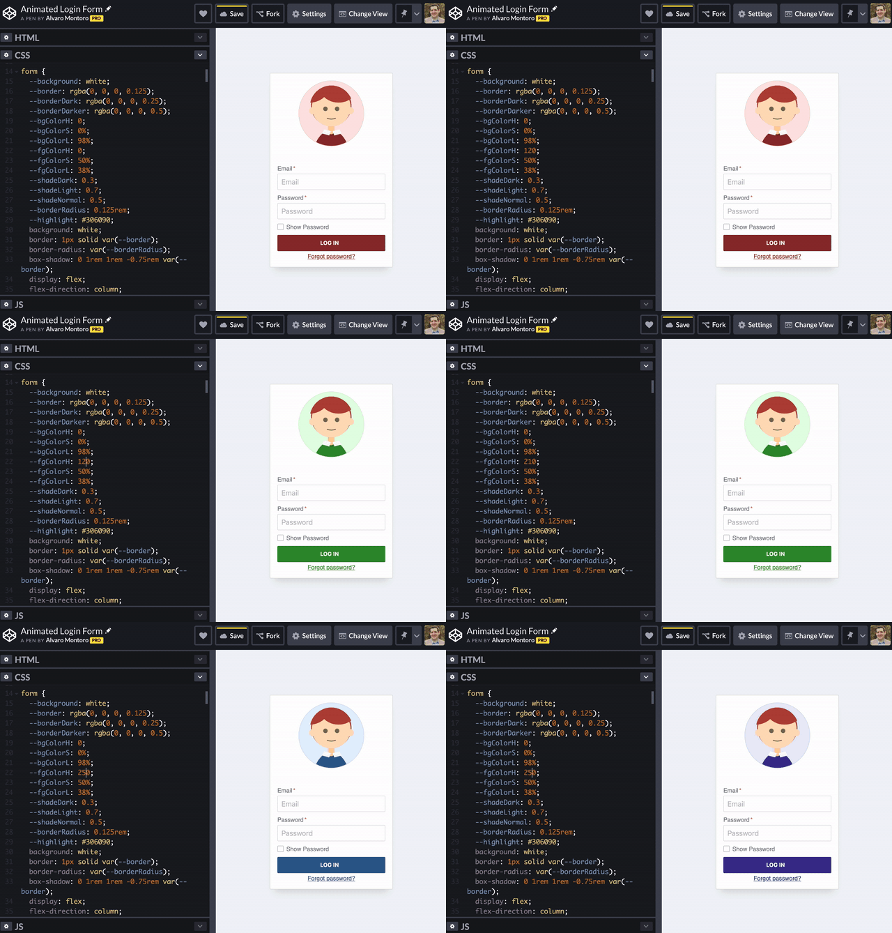
Playing with colors and HSL was not required for building the form, but it was fun.
Form validation
For this one, I didn't complicate myself: remove all the JavaScript validation and delegate it into the browser by using the standard HTML5 validation:
- Is the field required? Add the
requiredattribute to it. - Is it an email/password/phone/color/etc.? Use the right input
type. - Does it need to follow a specific structure? Use a
pattern.
This is just a demo. If it was something more important or something that needs to go to production, I would have JS alongside the HTML validation. But in this case, the goal is to avoid JavaScript, so...
Browser compatibility problems
After completing the development using Brave (a Chrome-based browser), I had found some issues:
- The show/hide password (that I used
-webkit-text-security). - The problem with
:valid/:invalidat the form-level in IE/Edge.
Still, I continued testing on different browsers and found a new issue. Yay! Safari seems to have problems with the rem unit being used in animations. The issues were solved by replacing the rem for their px equivalent.
Accessibility concerns
In all honesty, I was not expecting the login form to be accessible considering that I was playing with the Flex ordering and the styles. But after running some tests, the results were more positive than initially expected.
For example, if the page loads without styles, the login form looks like this:
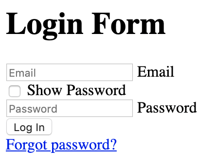
The label text appears after its field -which is peculiar, but still understandable-, and the "Show Password" field appears before the field. Also not that uncommon either (Senneff's form has it on top too after all.)
The results from running automated accessibility testing are not that bad either. Wave only finds three issues (related to the tabIndex) while aXe detects contrast issues in the labels (which is true for rest mode but not for hover or active).
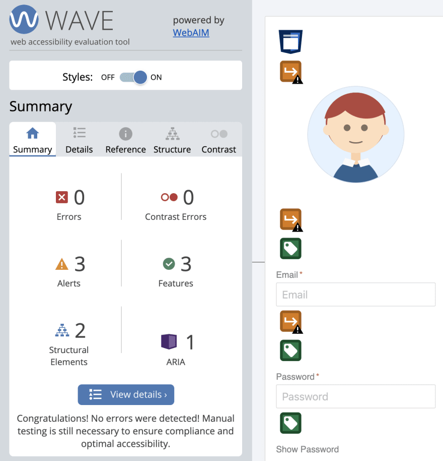
After that, I also tried interacting with the keyboard and using a couple of screen readers (VoiceOver and ChromeVox).
The results were positive on Chrome (the most used browser according to the latest WebAIM survey): tabbing through the fields happened in order and the screen readers read everything correctly even when the order in the code didn't match the order on the screen.
Safari was not so successful and got some issues when focusing on the checkbox (an issue that seems to happen commonly, and not only on my form... but that's not the point.)
This form is not something that I would use (completely) in production, as some of the features (password show/hide, form validity) are not supported in all browsers (IE and Edge being the main offenders). But developing it was a nice experiment.
And along the way, I got to practice some FlexBox, used some interesting selectors and pseudo-classes, learned about the -webkit-text-security (thanks to Chris Coyier's post on CSS-Tricks)... which is nice.

