
For this week's CodePen challenge, I created an animation of bats flying over people on a bridge using a single element and a still picture. This is a photograph in JPEG format, without transparencies or vectorial possibilities.
So... how do we go from a still photograph like this (original source):
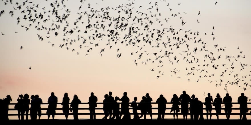
to an animation like the one below, without editing the image outside of the browser, changing its format, or modifying its original content at all?
And how could we achieve it using just one HTML element and a few lines of CSS?
Let's go step by step.
The HTML
First the HTML: we need to create an element that will contain the image:
<div><div>
And that's it! That's all the HTML that we will need. Everything beyond this point will be styling with CSS.
The CSS
Initial styling
The div should have the same proportion (width/height ratio) as the image because we will put it as background, and we want it to occupy the whole container. In our case that is easy: the image is twice as wide as it is tall, so the ratio will be 2:1.
Our initial CSS will include sizing the div and positioning it in an absolute way in the center of the screen:
div {
  /* this height and width values are specific to this example */
  width: 100vw;
  height: 50vw;
  /* center the div vertically and horizontally to make it look nicer */
  position: absolute;
  top: 50%;
  left: 50%;
  transform: translate(-50%, -50%);
}
We will come back to this div later, but we can let it rest for now and focus on the pseudo-element that will contain the image.
The image
With the following style, we will make it occupy the whole parent container, have the image as a background, and fit the image to the whole size of the container:
div::before {
  content: "";
  display: block;
  position: absolute;
  width: 100%;
  height: 100%;
  background: url("https://i.stack.imgur.com/w8noS.jpg");
  background-position: top left;
  background-size: 100% 100%;
}
Time to apply some filters!
The filters
Right now, the photograph is the original image without changes: a group of people on a bridge, looking at the flying bats.
We want to apply some CSS filters:
-
saturate(0): this will remove intensity from the picture, turning it into grayscale, and causing some surrounding colors to blend together. -
contrast(400%): by setting a high contrast value, we turn the grayscale photo into a black and white image, leaving a silhouette of the original picture. -
invert(1): flip the colors. This is done to add dramatism: the bats fly at night, the sky now looks black instead of white.
and the CSS for it is:
filter: saturate(0) contrast(400%) invert(1);
We have the target image filtering done: we turned it into a silhouette, the edges are sharper and now it looks more like a cartoon. It's time to move on to...
The blending
The mix-blend-mode property allows to specify how an element is going to blend with its parent and the background. By setting the value to multiply, the white colors will turn "transparent" and the parent will be seen through them.
So we just need to add one more CSS property to the div::before:
mix-blend-mode: multiply
Note: as I am using
mix-blend-mode, this code will not work on several browsers (including IE or Edge). Click here to see a list of the supported browsers.
The animation
There are only a couple more steps to finish the animation, and one of them is the CSS animation itself. We are going to create a shadow that moves from the bottom-right corner of the picture to the top-left side.
To achieve this, we use the regular @keyframes rule, with one black inset shadow that performs the movement that we want:
@keyframes moveShadow {
  0% {
    box-shadow: inset 0 -14vw 0 0 white,
                inset 50vmin 50vmin 15vmin 15vmax black;
  }
  100% {
    box-shadow: inset 0 -14vw 0 0 white,
                inset -75vmin -75vmin 25vmin 15vmax black;
  }
}
And we need to add it to the original div along with the pink background from the challenge:
animation: moveShadow 5s infinite;
background: #FF1EAD;
The impression is that the pink shadow is moving, but truly the background is pink, and it is a black shadow moving.
You may have notice that there is also a white shadow that doesn't move. We use that one to keep the people and the bridge visible. Otherwise, the image would be completely black with the shadow moving.
As a final touch, I made the background of the page be black at the top and white at the bottom so that the image looks more "fluid" and in line with the page.
Which leaves the result of a cartoon-like animation from a still photograph:
Final thoughts
With this challenge, I was able to play around and learn more about the CSS filters and blend modes, especially the latter, that include some properties that I hadn't used much in the past, and about which I have still a lot to learn.
I had a lot of fun doing research and completing this CodePen challenge and I'm looking forward to the next one :)
* This article was originally posted on CodePen on January 27, 2019.