
In this post, we are going to see different methods to draw a triangle in CSS. We will focus on three in particular: the traditional method using borders and two more modern options with clip-path and linear-gradient().
Using border
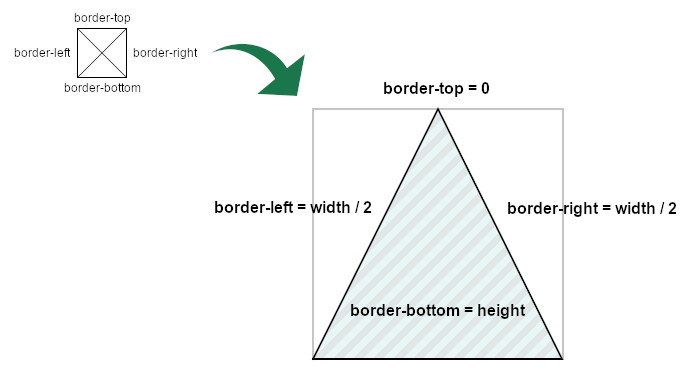
This is the "classic" way of drawing a triangle in CSS, and it seems like the most popular one by far. It consists of having a single colored border, leaving the others transparent. These are the steps to achieve it:
- Set a
widthandheightof 0. - Set the border color to transparent.
- Set the top border to 0.
- Set the side borders to half the width.
- Set the bottom border to have the full height.
- Set a color for the bottom border.
It may not sound easy, but it is relatively simple:
Depending on where you want the triangle to point to, you will adjust the corresponding borders' sizes and colors.
This method appeared a long time ago, and it is a "hack." It works in all browsers, and it will continue working in future browsers, but it is not how the borders were intended to be used.
Because of that, it doesn't play nice when we try to add content. It doesn't scale properly, so the container size needs to be known, and the values need to be specific for that triangle.
Pros of this method:
- Support: it works in every browser (even old versions of IE)
- Simple: it's easy to program, as shown in the example above.
Cons of this method:
- Difficult to maintain: changing size requires changing the code.
- Rigid design: if we add content, the result will likely not be the expected one.
Borders will work very well in a specific situation: empty triangles with a fixed size. Outside of that, problems arise. We must remember that this is a hacky solution from a time when there were no other options.
Using background-image
We could use an inline SVG in CSS, which would work fine... but it would be cheating, as we would be using an image instead of CSS.
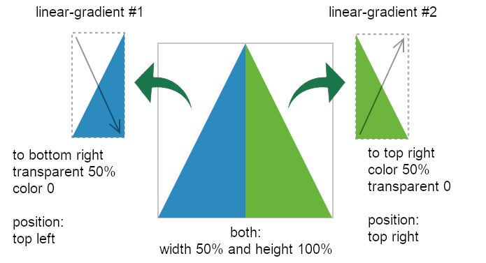
Instead, let's create the triangle using background-image but without an actual image. We can achieve that by adding two linear gradients. One for each side of the triangle.
The idea would be to do this:
- Add a
linear-gradienttowards the bottom right corner (transparent to red with a hard change at 50%) - Add a
linear-gradienttowards the top right corner (red to transparent with a hard change at 50%) - Set the size of both
linear-gradientto 50% width - Position one
linear-gradientat the beginning and another at the end of the container.
This sounds more complicated than the borders! And I'm not going to lie, it is... but not much. Here is a schema of how it looks:
The result is graphically similar to the triangle created with the borders:
But it has some key differences: mainly, this solution is responsive to changes in the container's size. There's no need to calculate anything or use CSS variables.
Also, as the container is still a rectangle, formatting, positioning, and styling the text within the triangular shape is more "natural."
Pros of this method:
- Support: it works even in older browsers (IE10 and up.)
- Responsive: it adjusts to the container's size.
- Perfect for text: The container shape is not affected, so adding text or other content is straightforward.
Cons of this method:
- Complex: this option is probably the most complex one to develop.
- Tricky for options: having, for example, a linear gradient is more complicated (but feasible.)
Using clip-path
clip-path is the "latest" of the three. And I put "latest" between quotes because it has been supported for over 10 years in Firefox and Chrome (with prefix), and its support started around the same time as linear-gradient().
With clip-path, you can define a clipping section which will be the only visible part of the element. To draw a triangle, we'd only have to define a polygon with three points like in the image:
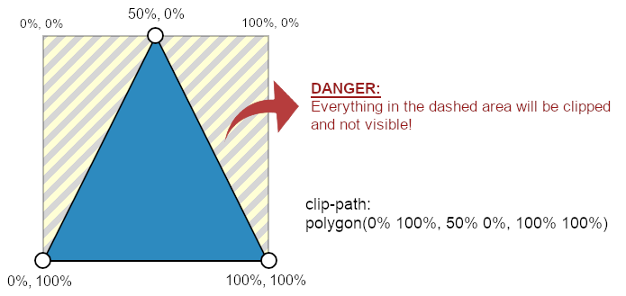
polygon() makes it easy and responsiveThe code to achieve this is incredibly simple thanks to the polygon() function. We only need the bottom-left (0% 100%), center-top (50% 0%), and bottom-right (100% 100%) coordinates and we are done!
One important thing to remember is that everything outside the clipped area is basically gone. And that includes not only the content but also "external" elements like shadows, outlines, or borders. (Adam Kuhn has a great solution for this.)
Polygons are only the tip of the iceberg: circles, ellipses, and with the latest support for path(), basically, any shape that you can imagine is possible with clip-path.
Pros of this method:
- Easy:
clip-pathis a game-changer for CSS. It is powerful and versatile, allowing any shape and not only triangles. - Responsive: it adjusts to the container's size and its changes.
- Customizable: gradients and effects are not a problem as long as they are within the visible area.
Cons of this method:
- Support: no version of IE supports
clip-path. Not all functions are supported across the board (polygon()is, though). - "Mistake prone": everything outside of the clipped area is gone, which may lead to unexpected results.
Conclusion
CSS has improved over time and now provides drawing tools —
such as clip-path or background-image—
to create triangles (or shapes) that are simpler, more flexible, and easier to maintain than using borders.
It makes sense to move on from using the more rigid borders and start using the appropriate tools for the task. The same way that we wouldn't hammer a nail to the wall using a screwdriver... we'd use a hammer!
Nevertheless, each method has its pros and cons, and there are situations in which one may be better than the others. If borders work for what you need, use them. But it would be natural for that method to fade away with time.
We moved from table layouts to floating containers and then from floating containers to Flexbox and Grid. It would make sense to move from using borders to new methods more suited for the job.