
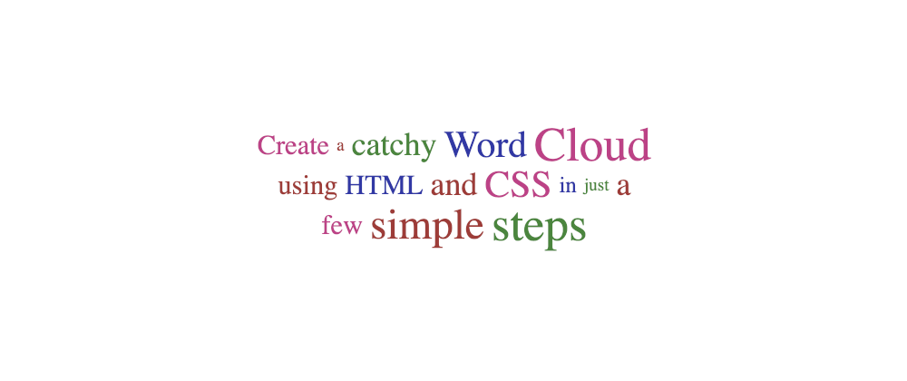
A tag cloud is a list of links associated with a term or a tag. It is common to see them in blogs and websites to highlight popular topics visually: more popular words/categories will have larger font sizes, and less popular topics will be presented in smaller font sizes:
Without getting into the details of their efficiency and usability (or lack thereof), tag/word clouds are eye-catchy and pretty, and a nice way to visualize the overall content of a site or article.
In this article, we will see how to create a tag cloud in HTML and CSS. It is important to note that each term's weights/popularity will have to be pre-calculated using a different language. We are going to focus exclusively on the presentation.
Basic HTML structure
As we mentioned before, a tag cloud is a list of links. So, from a semantic perspective, it makes sense to use an unordered list (<ul>) as the terms will not be sorted by popularity... otherwise, it would be a rather boring cloud.
Inside each list item, there will be a link to the tag/term search page. Which would lead us to a basic yet straightforward structure:
<ul>
  <li><a href="/tag/word1">Word1</a></li>
  <li><a href="/tag/word2">Word2</a></li>
  <li><a href="/tag/word3">Word3</a></li>
  <!-- ... -->
</ul>
The popularity (or weight) of each word will be pre-calculated, and it should be added to each item in the <li> or the <a>. We'll opt to have it on the link, but it could be at the list item level.
A higher weight means that the tag is more popular and it should be displayed in a larger font size:
<ul>
  <li><a href="/tag/word1" data-weight="3">Word1</a></li>
  <li><a href="/tag/word2" data-weight="7">Word2</a></li>
  <li><a href="/tag/word3" data-weight="4">Word3</a></li>
  <!-- ... -->
</ul>
Note: an alternative would be to have a
data-countanddata-totaland calculate the weight directly on CSS. This is possible following the standard, but no browser supports it yet (as we will see later). To avoid that, we could have two data-attributes:data-weightanddata-countfor each tag. That would work better. For simplicity reasons, we will focus on only one data-attribute:data-weight.
With that, we are almost done with the HTML structure –there will be some changes later, but let's not get ahead of ourselves–, we still want to tweak a little bit the <ul> to add some attributes:
-
class: which will be helpful to target which lists to style as a cloud. -
role: this is a navigational component; we want to identify it to screen readers and other assistive technologies (AT). -
aria-label: used to give it a "title" or description to ATs.
Note: we may skip the
role="navigation"if the list is inside a<nav>tag. Instead ofaria-label,we could usearia-labelledbyto point to a navigation title.
Let's expand the HTML from our example, also including Web Development terms to make it a more realistic example:
<ul class="cloud" role="navigation" aria-label="Webdev tag cloud">
  <li><a data-weight="4" href="/tag/http">HTTP</a></li>
  <li><a data-weight="2" href="/tag/ember">Ember</a></li>
  <li><a data-weight="5" href="/tag/sass">Sass</a></li>
  <li><a data-weight="8" href="/tag/html">HTML</a></li>
  <li><a data-weight="6" href="/tag/flexbox">FlexBox</a></li>
  <li><a data-weight="4" href="/tag/api">API</a></li>
  <li><a data-weight="5" href="/tag/vuejs">VueJS</a></li>
  <li><a data-weight="6" href="/tag/grid">Grid</a></li>
  <li><a data-weight="3" href="/tag/rest">Rest</a></li>
  <li><a data-weight="9" href="/tag/javascript">JavaScript</a></li>
  <li><a data-weight="3" href="/tag/animation">Animation</a></li>
  <li><a data-weight="7" href="/tag/react">React</a></li>
  <li><a data-weight="8" href="/tag/css">CSS</a></li>
  <li><a data-weight="1" href="/tag/cache">Cache</a></li>
  <li><a data-weight="3" href="/tag/less">Less</a></li>
</ul>
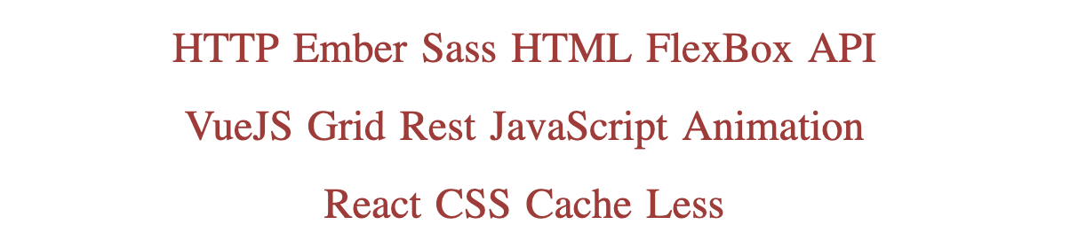
This is how our tag cloud looks like right now:
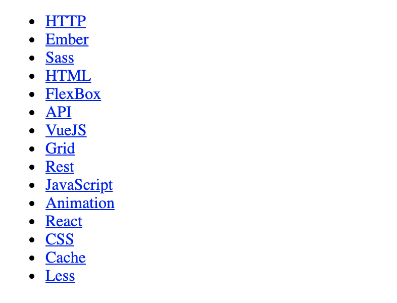
It is just a simple list of links without styles or any eye-popping features... let's change that.
Styling the tag cloud
These are the features that we are going to add with CSS:
- Remove the list look-and-feel and make it inline.
- Make tags' font-size depend directly on the value of
data-weight. - Add the tag's weight next to the label.
- "Randomize" tags' colors to provide.
- Animate the
:hoverand:focusstatus, providing an accessible alternative to avoid motion.
Styling the <ul>
First, we delete the circles in the list items and remove the list indentation with list-style and a padding-left of zero:
  list-style: none;
  padding-left: 0;
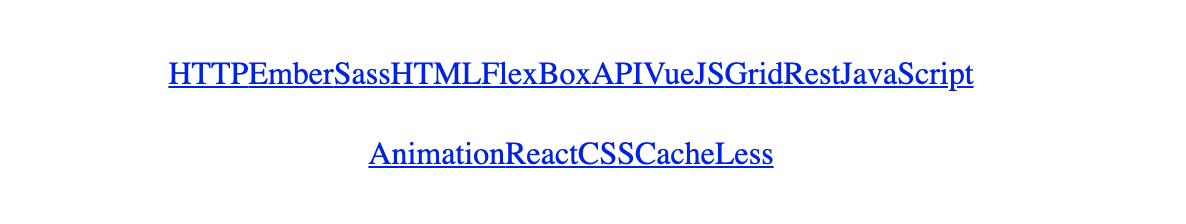
Then, we set the ul's display to Flexbox, center align the items vertically and horizontally and make sure that all elements will be visible by wrapping into multiple lines:
  display: flex;
  flex-wrap: wrap;
  align-items: center;
  justify-content: center;
After adding a line-height to ensure some vertical word spacing, the final styles for the ul look like this:
ul.cloud {
  list-style: none;
  padding-left: 0;
  display: flex;
  flex-wrap: wrap;
  align-items: center;
  justify-content: center;
  line-height: 2.5rem;
}
Our tag cloud still doesn't look much like a tag cloud:
Adjust tag size depending on the weight/popularity
Let's start by styling the links a little:
ul.cloud a {
  color: #a33;
  display: block;
  font-size: 1.5rem;
  padding: 0.125rem 0.25rem;
  text-decoration: none;
  position: relative;
}
With the styles above, all the tags/words will be red-ish and have a fixed size of 1.5 rem:
We want to have a font-size based on the data-weight attribute. So... how can we do that?
The web standard includes a way of reading HTML data-attributes from CSS by using the attr() function. We can read the value of data-weight by doing something like this:
attr([attribute-name] [attribute-unit]? [, default-value]?)
Unfortunately, that notation and functionality are not supported by any browser at the moment. Instead, attr() will only return a string and can only be used in the content property.
If the standard notation worked, we could read the data-attributes with the weight (or the total and the count, as described above), save them into a CSS variable, and do operations directly with them, like this:
ul.cloud a {
  --size: attr(data-weight number, 2);
  font-size: calc(var(--size) * 1rem);
}
...But we cannot do that. Instead, we can add a set of CSS rules with the selectors based on an attribute: the data-attribute.
ul.cloud a[data-weight="1"] { --size: 1; }
ul.cloud a[data-weight="2"] { --size: 2; }
ul.cloud a[data-weight="3"] { --size: 3; }
ul.cloud a[data-weight="4"] { --size: 4; }
ul.cloud a[data-weight="5"] { --size: 5; }
ul.cloud a[data-weight="6"] { --size: 6; }
ul.cloud a[data-weight="7"] { --size: 7; }
ul.cloud a[data-weight="8"] { --size: 8; }
ul.cloud a[data-weight="9"] { --size: 9; }

ul.cloud a {
  --size: 4;
  font-size: calc(var(--size) * 0.25rem + 0.5rem);
  /* ... */
}
That, combined with the new function to calculate the font-size (keeping the original one caused too large sizes), results in a basic tag cloud:

This is only our first iteration. With just a few more CSS lines, we can add more flair (and functionality) to the component.
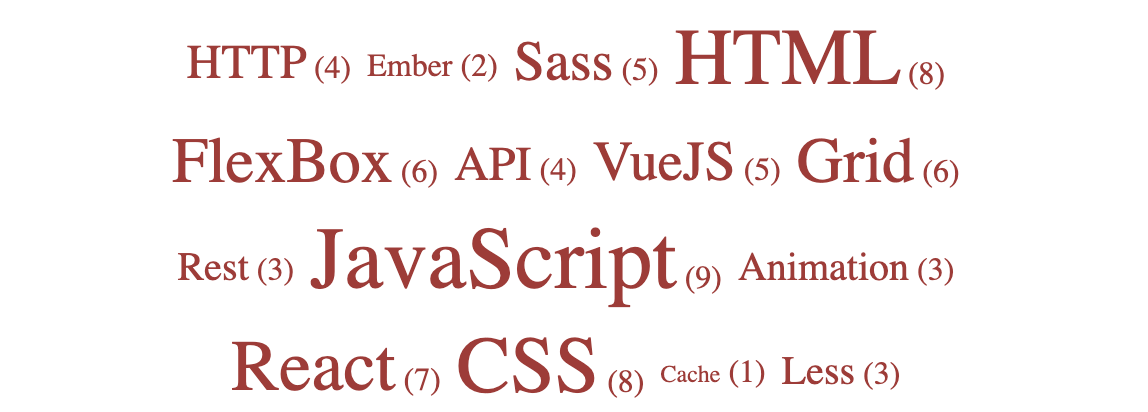
Add the tag's popularity next to the label
Many tag clouds display not only the term but also the weight/value next to it.
We have the value. It's in the data-attribute that we use to specify the font-size. And displaying a data-attribute is straightforward in the content of a pseudo-element like ::after:
ul.cloud[data-show-value] a::after {
  content: " (" attr(data-weight) ")";
  font-size: 1rem;
}
We added an attribute selector to the cloud: [data-show-value]. That is by design. By adding it, the value/count/weight will only be displayed if the list has the data-attribute data-show-value. If it doesn't have it, then the number will not be displayed.
That way, we are adding customization to our web component:
- Add
data-show-value: the numbers are displayed - Remove/Don't add
data-show-value: the numbers are not displayed.
Note: the data-attribute
data-show-valueis a boolean that works likecontrolsin avideotag: as soon as it appears, it will activate the functionality, even if the value passed is "false."
Adding data-show-value will result in our word cloud looking like this:
We will deactivate/remove that attribute for the rest of the demo.
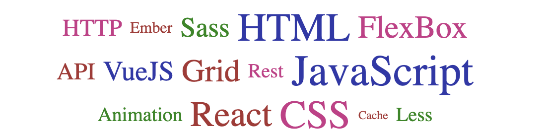
Add colors
A monochrome cloud looks dull. We are going to spice it up by adding colors. And we are going to try two different approaches.
Using "random" colors
There's no randomness in CSS (although it can be simulated). What we will do is add different colors to the tags, depending on their order by using the following selectors:
ul.cloud li:nth-child(2n+1) a { --color: #181; }
ul.cloud li:nth-child(3n+1) a { --color: #33a; }
ul.cloud li:nth-child(4n+1) a { --color: #c38; }
This way, we will be adding some green, blue, and purple to the already existing red color. They will follow a pattern, but this may not be obvious to the user:
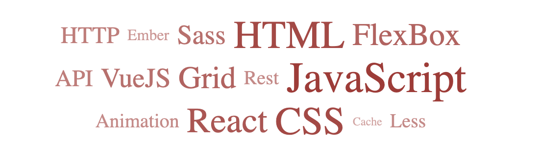
Using different tones of the same color
Similar to what TagCrowd does (see the first image), we can highlight the popular tags by adding more contrast. On a light background, this can be achieved by making them darker.
The HSL color format would be incredibly convenient for this. But a quicker option could be making the tag semitransparent inversely proportional to the data-weight (transformed into the CSS variable --size):
ul.cloud a {
  opacity: calc((15 - (9 - var(--size))) / 15);
  /* ... */
}
With this code (instead of the one in the previous section), the tag cloud looks like this:
Customize outline
It is important to be extremely careful when touching the outline. It is a key property for accessibility, and a bad value could make the component (or the whole website) difficult to use for people with disabilities.
In this case, we will add a border of the same color as the text, replacing (not removing) the default outline on focus.
ul.cloud a:focus {
  outline: 1px dashed;
}
And again: extreme caution when changing the outline. This section is optional.
Add animations
To add some interactivity, we will add a simple animation: when the user focuses on or hovers over one of the links, the background will change color horizontally.
Because it is an animation depending on the state, we will use transition instead of the animation property.
We will add a ::before pseudo-element with no width, and on :focus or :hover, we will update the width to 100% of the container, creating a micro-interaction.
The CSS code or the pseudo-element and the state behavior is:
ul.cloud a::before {
  content: "";
  position: absolute;
  top: 0;
  left: 50%;
  width: 0;
  height: 100%;
  background: var(--color);
  transform: translate(-50%, 0);
  opacity: 0.15;
  transition: width 0.25s;
}

ul.cloud a:focus::before,
ul.cloud a:hover::before {
  width: 100%;
}
One final point for the animations: users may not like them and have them disabled. If that's the case, it is important to respect the user's preferences and remove the animations.
This can be achieved with the [prefers-reduced-motion] media feature](https://developer.mozilla.org/en-US/docs/Web/CSS/@media/prefers-reduced-motion).
@media (prefers-reduced-motion) {
  ul.cloud * {
    transition: none !important;
  }
}
And with that, our tag cloud is complete! Here is a demo with all the code above together:
Conclusion
There are many ways to create a tag cloud: with HTML and CSS, with lists, without lists, using JavaScript... All (or most) of them valid and beautiful.
I'm not going to claim that the one described above is the best way, but it is possibly one of the simplest clouds you will find. And also quite complete: different variants, customizable, less than 100 lines of code between HTML and CSS... And it's that simplicity and potential that makes it so pretty.
And it has room for improvement and expansion, which is always nice. So if you try building a word/tag cloud following this post, please share a link with a demo!