
It all started with a demo from @jheyy (that for some reason doesn't seem to work on my computer anymore) in which without using a single HTML element, he created a Mario Cart animation... and then a tweet:
Hey @alvaro_montoro , I challenge you to make a game out of this pure CSS @codepen from @jh3yy (the road is a single pseudo element)
— Rafael zero 🏳️🌈 (@racascou)November 20, 2020
codepen.io/jh3y/pen/rNLqR…
I was excited about the challenge and hate to admit that I tried to change JHey's code but couldn't fully untangle it. I got it to do some things, but not much... so I decided to do something independently. It wouldn't be as fancy, but it would make it work.
The result is on this CodePen. And you can watch a demo on Youtube:
NOTE: I just linked the demo instead of embedding it on the article because WebKit browsers (Chrome, Safari, Brave, new Edge, etc.) seem to have issues with large animated and tilted elements and causes browsers to slow down or flash colors. The demo will work better on Firefox.
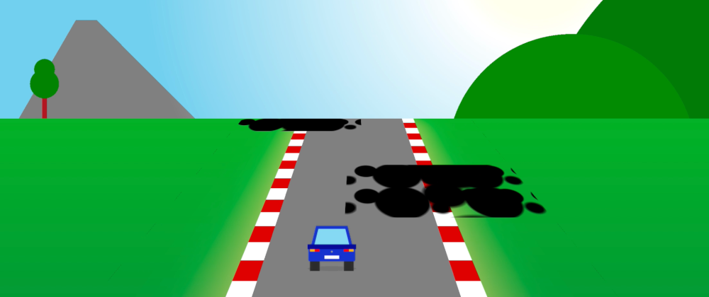
The game actually works (with some quirks, as we'll see later.) And, as it can be seen in the linked Codepen, it is composed of:
- 200 lines of CSS (including comments).
- 0 lines of JavaScript.
- 0 lines of HTML.
The zero lines of HTML are just an illusion: there's still a basic HTML structure with the <html> and <body> tags (as we explain in this other article)... and we'll use them to generate the game.
What is this witchcraft? How was it done? Let's see it.
But before that, let me say that this is a fun approach to Web Development and CSS, and it's great for practicing and learning, but it has a little-to-none practical outcome. The result is a nice demo, but never try something like this on a production site.
How it was done
The article will contain explanations with plenty of details, but if you want to see a video of the process, you can watch this on my Youtube channel:
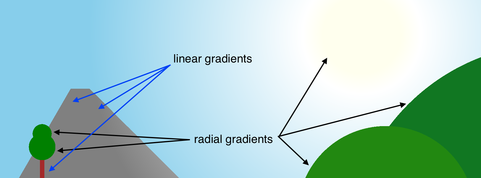
Even when we have only two elements (<html> and <body>), we can style six if we count the ::before and ::after pseudo-elements for each of them.
This game only uses 5 of the six.
The html: background and cursor
The styles for the html will include three important parts:
- The basic game background with a blue sky and green ground.
- A customized cursor that looks like a car.
- Perspective, so some elements look 3-dimensional (we'll see this later).
The background can be achieved with a linear-gradient. Nothing fancy for the sky because it will be covered by another element later. The ground will also include some other radial-gradients so it's not just plain green but has different tones and shapes.
The customized cursor may be a bit more interesting. In CSS, we can specify which cursor will be used with the cursor property. We can pick among a list of system cursors or set an external image using url().
We wanted to have all the code encapsulated in the CSS, so we opted for an inline SVG instead of an external image file. You can add an inline SVG using the data: protocol like this:
html {
  cursor: url(data:image/svg+xml;utf8,<svg xmlns='http://www.w3.org/2000/svg'>...</svg>), auto;
}
Two key things when specifying a custom cursor:
- You must always include a system fallback. Otherwise, the browser will not display the image as the cursor.
- The inline SVG must include the
xmlnsattribute, or the SVG will not be rendered.
For the inline SVG, we used rectangles and paths to simulate a small car. The result is simple but catchy:

One last detail for the car: the top-left corner of the car is the actual pointer; this is not natural because you can go on top of one of the obstacles and still not lose.
The cursor property allows setting a coordinate of where the pointer will be within the cursor. The value has to be smaller than 32, though. So we change the CSS accordingly:
html {
  cursor: url(data:image/svg+xml;utf8,...) 31 31, pointer;
}
html::before: the road
Thanks to the perspective in the html –we said we would see it later–, we can create a gray rectangle with the ::before pseudo-element, and apply a 3D rotation to make it look like the road is fading away, getting smaller in the distance.
The tricky part with this one was the size. Initially, the height was 100%, but it fell short of the horizon's edge after the rotation. We had to adjust the height to make them match manually.
NOTE: there's a mathematical formula to calculate the exact height. But it was faster a try-error that got a close-enough value within seconds.
To paint the road, we use two linear-gradients:
- One horizontal for the paved area (transparent-gray-transparent).
- One vertical for the red and white shoulder lines.
Finally, we create a small animation to make the background move from top to bottom, so it simulates the car is moving. Talk about relativity! The car stays in the same place; it's the whole world that moves under its tires.
@keyframes moveRoad {
  0% { background-position: 0 0; }
  100% { background-position: 0 16.3vh; }
}
We later added some shadows and blur to decorate the road a little. Nothing fancy, though.
html::after: the sky
html's ::after pseudo-element is used to draw the sky and some mountains on the horizon, but it also serves a fundamental purpose: hide the overflow of the body.
As we will see in the next section, the body "overflows" its container, and it may look like it flies into the sky. To avoid that, we place the sky on top of it. Then we decorate it with the sun, some mountains, a tree or two... and it looks like a charm.
We used a' radial-gradient' to generate the sun and the rounded mountains; For the mountain and the tree, we used linear-gradient. Then played a bit with the background sizes and positions to set everything in place.
body: the fun begins
This is the tricky part, one that, if you see the video, got me hitting my head against the desk for a little bit.
The idea is to use the body to create a path that the car must follow to "win the game" (the game never ends, so the only option is to lose eventually).
First, we start by making it a REALLY tall element and tilting it at the same angle that we rotated the road; that way, it will overlap it.
AUTHOR'S NOTE: Here is where my problems began. I was coding on a WebKit browser, and it started struggling with the large tilted elements. Especially after cropping and animating them. At this point, I changed my development browser to Firefox, which seemed to do just fine.
We can create this by cropping the body using clip-path. We only keep some parts of the track available with a zig-zagging path while removing/clipping the rest.
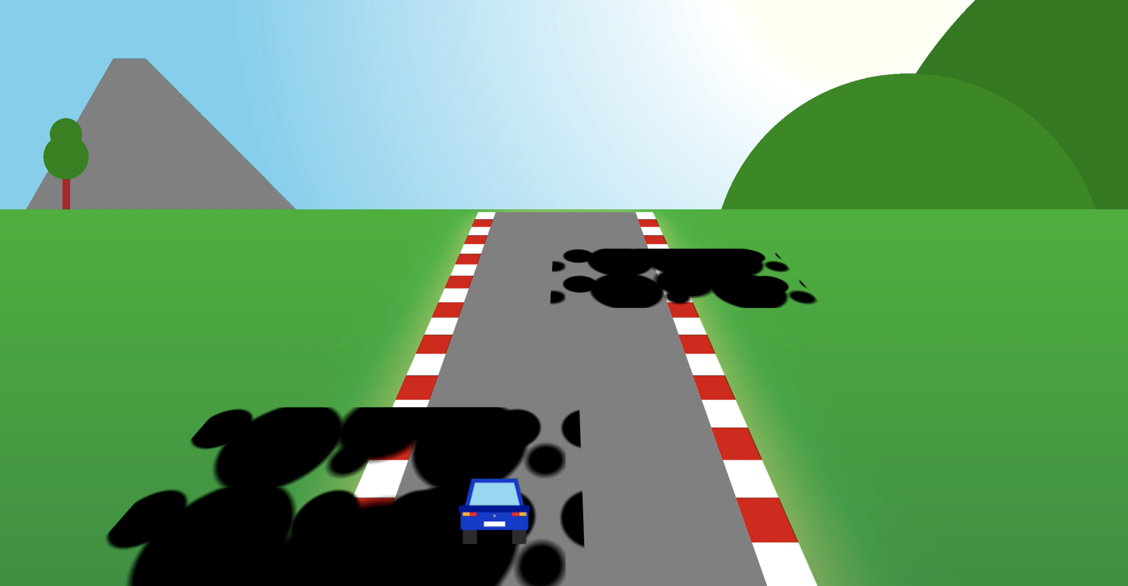
Now the car/mouse can move from right-to-left (and vice versa) on top of the body but without mousing over it, because it has been clipped—time to draw some grease stains with radial-gradient.
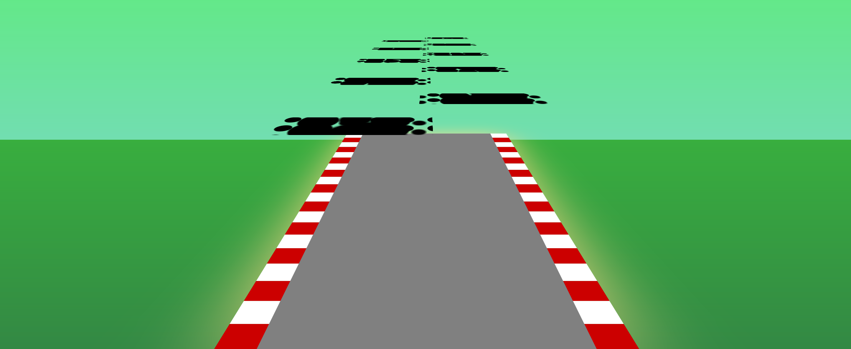
html::after, the road would be visible over the horizonWe then add animation, so the road/obstacles move from top to bottom. We can do that using the translate transform (no need for 3Ds now).
The only thing left to do would be to stop the game when the car/mouse goes on top of the grease stains. And for that, we still have two pseudo-elements left... but we only need one.
body::after: the end screen
The body::after pseudo-element will be a Game Over screen. It will be invisible by default (display: none) and only show up when the mouse goes over the body (aka, when the car goes on top of a grease stain).
We will also have to style the body. In this case, it is important that we:
- Remove the
clip-path. Or the game over message will be cropped too! - Adjust the height to the viewport. Instead of being a really tall container.
- Remove the 3D rotation. Or the game over message will be tilted too!
- Remove the animation. So the message doesn't just slide out the viewport.
- Add a z-index. So the
bodygoes on top of thehtml::after.
We can do all that by resetting styles with a couple of rules:
body:hover {
  transform: none;
  width: 100vw;
  height: 100vh;
  top: 0;
  left: 0;
  z-index: 1;
  clip-path: none;
  animation: none;
  background: none;
}

body:hover::after {
  display: flex;
}
We used Flexbox for the body::after so we could easily center text with align-items and justify-content.
One trick to add multiline content in a ::before/::after pseudo-element is putting a \a wherever the new line should go, and then adding a white-space: pre so the blank spaces are preserved:
body::after {
  content: "GAME OVER \a\a Move the mouse \a outside of the window \a to restart the game";
  white-space: pre;
  /* ... */
}
Extra features and concerns
Custom settings
One cool thing about this game –or at least, I think it's cool–, is that it can be easily configured.
By replacing some values with CSS variables, we can adjust different animation and game settings by updating a single line of code. Seriously, isn't that cool?
In this game, we added three settings:
- Speed: it is the time in seconds of the animation that moves the grease stains from top to bottom. Lower numbers will make the game faster (and more difficult).
- Timing: the animation timing function. By default, it is "linear," which means that the animation is at the same speed all the time. We could change it to any value and make the game move at different speeds, making it more difficult.
- Animation: the animation iteration count. By default, it is "infinite," which means that the game will run continuously, but you can change the value to any number... Not the best variable name tbh.
AUTHOR'S NOTE: I tried adding a fourth CSS variable for the player to be able to pick a high/low-resolution version of the game (it plays nicer on smaller screens or with low-resolution). But the result was not as expected... One improvement to add later.
The :hover problem
For the player to lose, they must place the car/mouse over a grease stain... but there's a problem: the :hover state is only triggered if the mouse is moving.
If the player places the car in the middle of the road and then releases the mouse, the browser will not trigger the :hover effect, and the game will never end.
This behavior makes sense from a security point of view: we don't want to trigger a :hover side effect unintentionally (e.g., without any interaction from the user)... it is just a bit unfortunate for this game (and for this one too).
Also, there's another catch. Because of the perspective, the body "shrinks" as it moves up the screen. This means that the page's sides are not covered by the body and could be used to trick the game.
A possible solution for this would be to make the width of the body much larger, say 200vw instead of 100vw. That would solve the problem but would make the animation struggle and lag.
An option to make it a bit more performant would be using actual images for the backgrounds and image stains. The browser would not need to compute as much, and the animation should be smoother.
Final thoughts
It was a lot of fun to develop this game. The coding took around two and a half hours (the video above is at 20x, so it lasts only 7 minutes), and required some additional time for planning.
As we mentioned above, this is not really practical, although it is a great way to learn and explore CSS.
It is a pity that it doesn't work smoothly on WebKit browsers (they are the most extended ones at the moment). A new challenge will be to develop a second version without so many 3D rotations and animations, which should make it nicer for those browsers.